VISUAL DESIGN
Part B
“This section presents a range of my digital design works, from conceptual projects to real-world professional experiences. It includes album artwork, poster design, brand identity systems, and responsive websites. By combining creative experimentation with practical execution, I explore how visual language can communicate ideas effectively across both personal and commercial contexts.”
⋰ Think it
⋰ Make it
⋰ Feel it
⋰ Share it
⋰ Think it ⋰ Make it ⋰ Feel it ⋰ Share it
Professional Work
A collection of my visual experiments and graphic design works using Adobe Illustrator and Photoshop. This section is divided by format—album covers, posters, and brand identity—to showcase both conceptual thinking and technical execution.
-
Visual experiments exploring mood, rhythm, and emotional storytelling through album covers and posters.
-
A collection of editorial layouts and magazine spreads designed with a focus on typographic hierarchy, grid systems, and visual storytelling.
-
This section presents brand and corporate identity design projects that include logo development, color systems, typography guidelines, and visual strategy. Each project focuses on creating a consistent and recognizable image across various applications.
-
This section includes branding systems and digital design projects that explore how a brand’s core values are translated across both physical and online platforms. From packaging and product mockups to web layouts and responsive UI, each work reflects a unified visual identity.
-
Item description

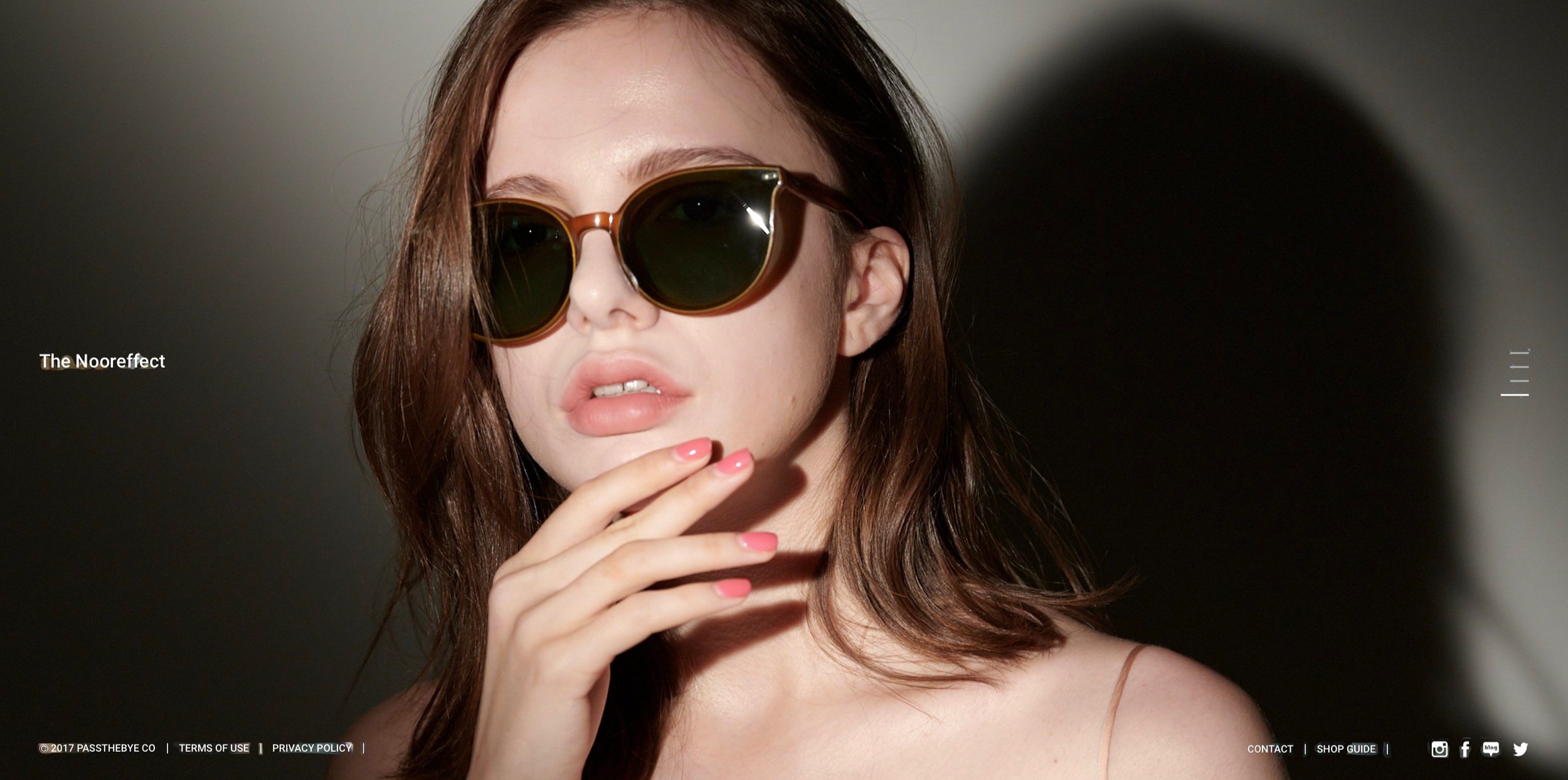
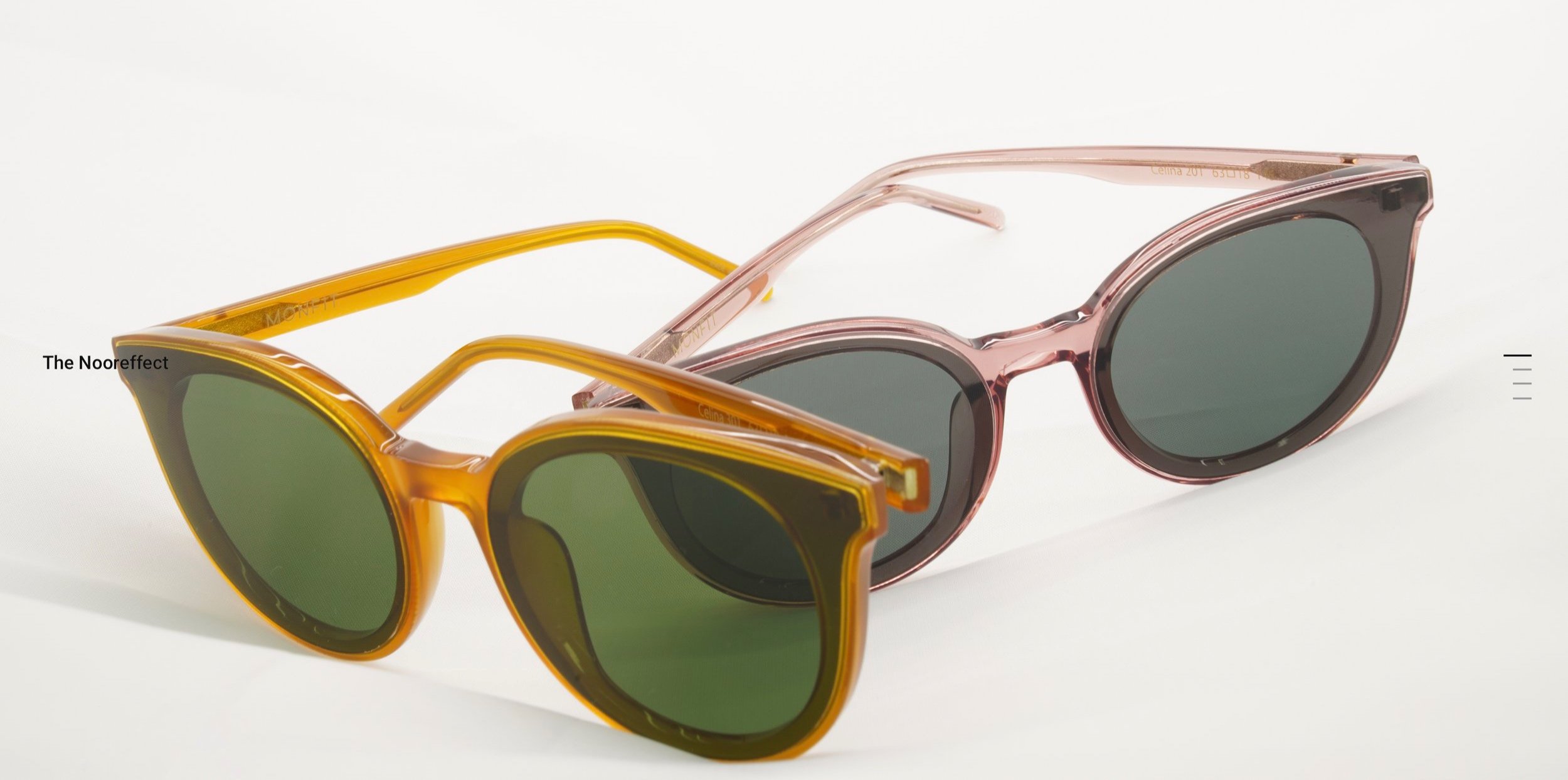
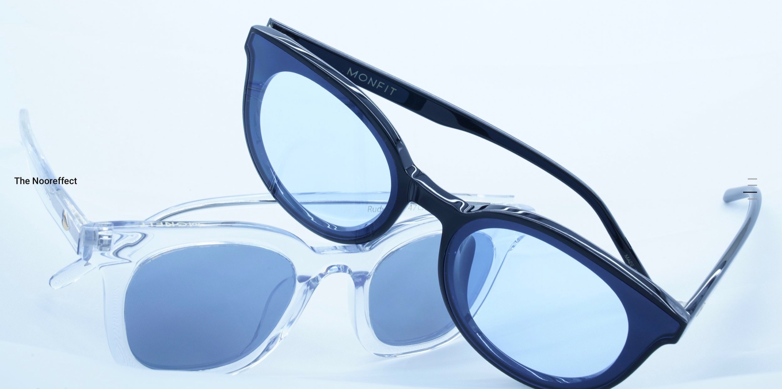
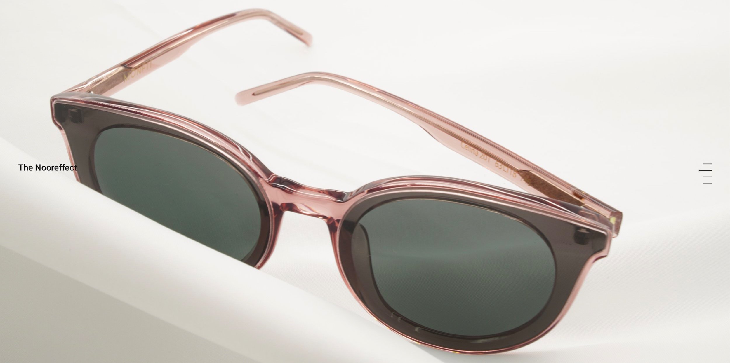
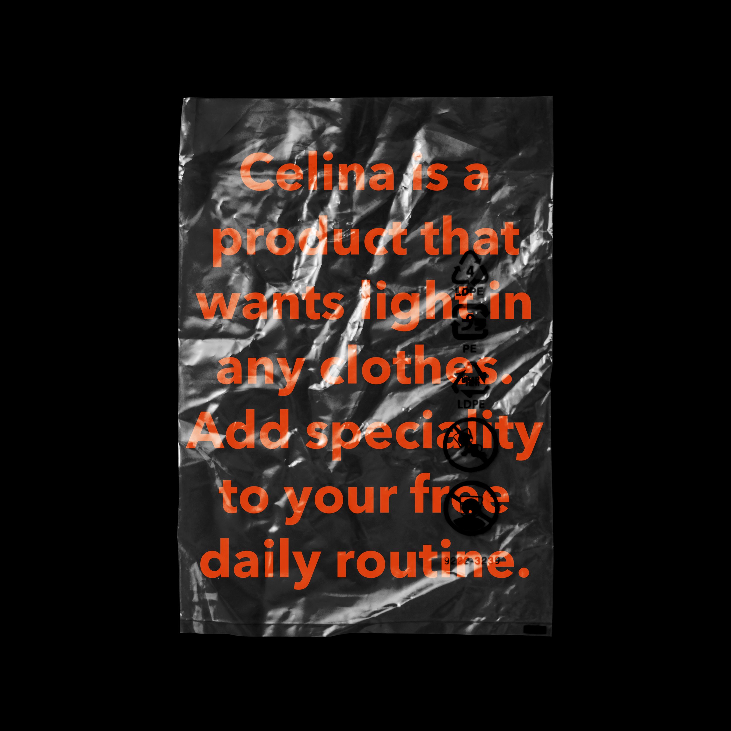
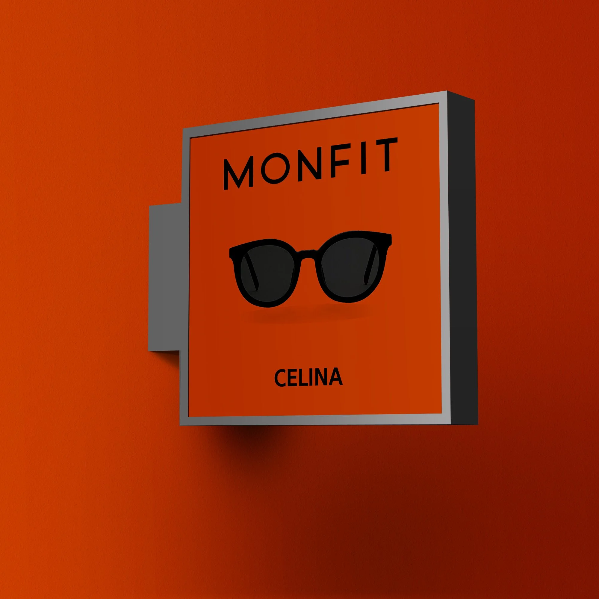
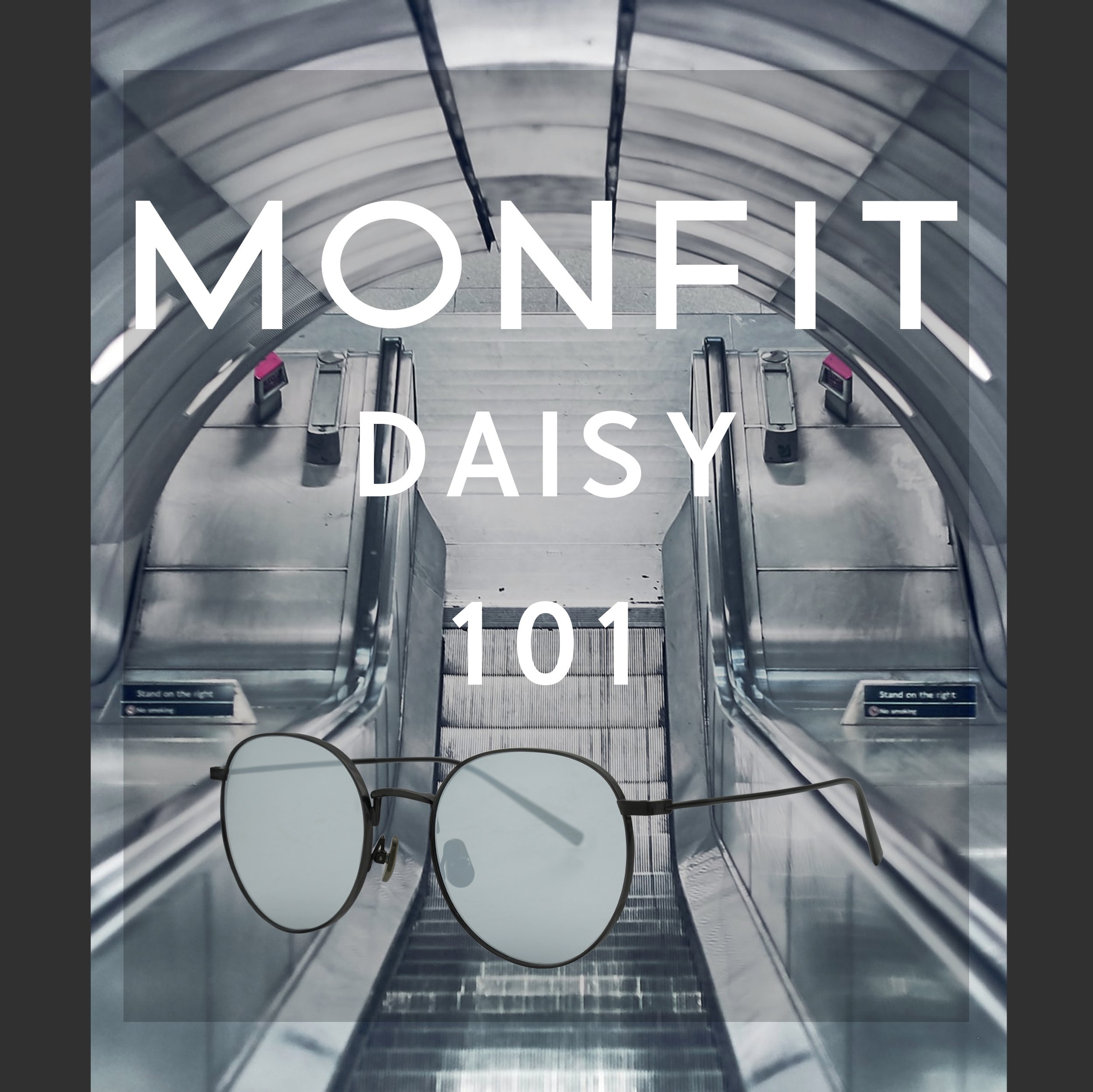
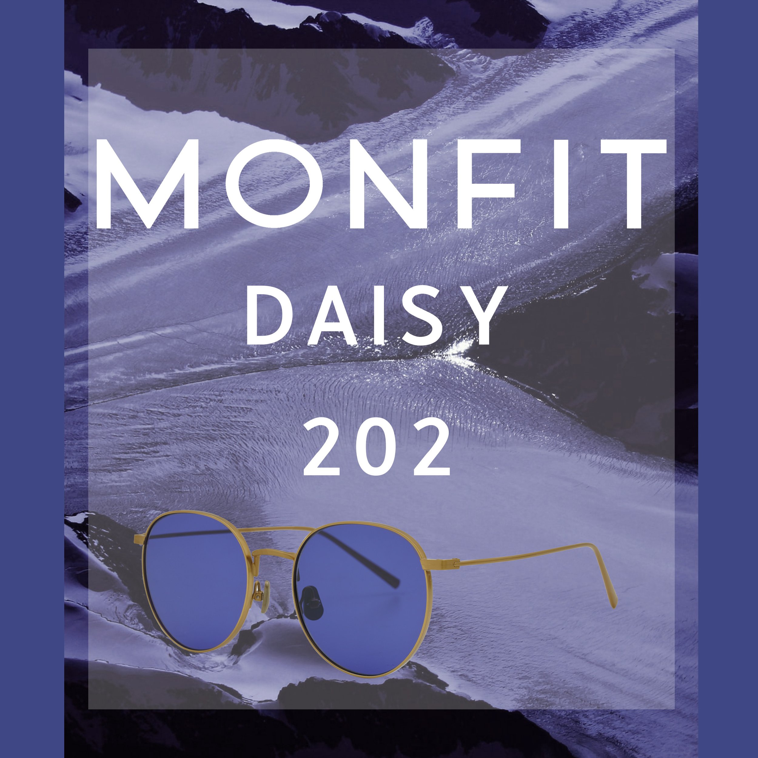
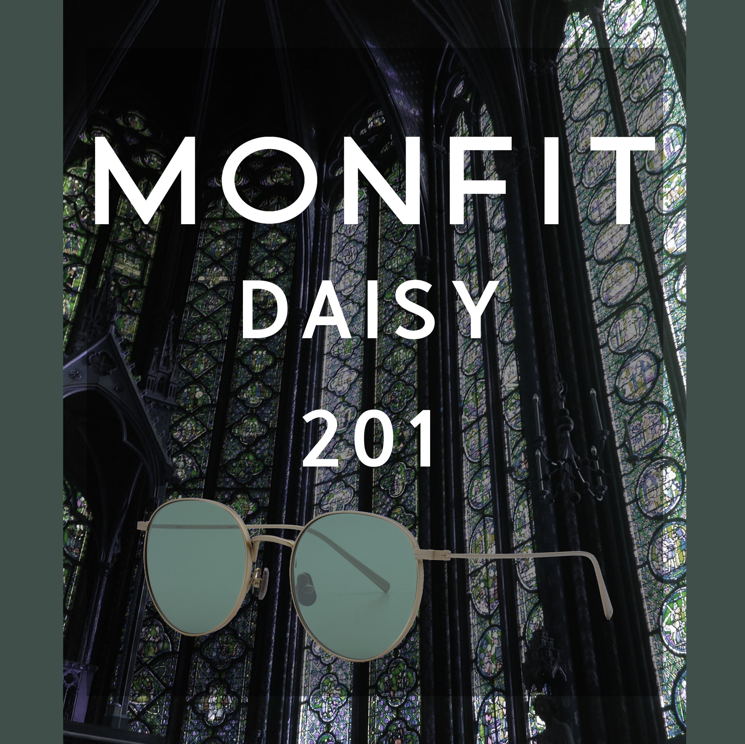
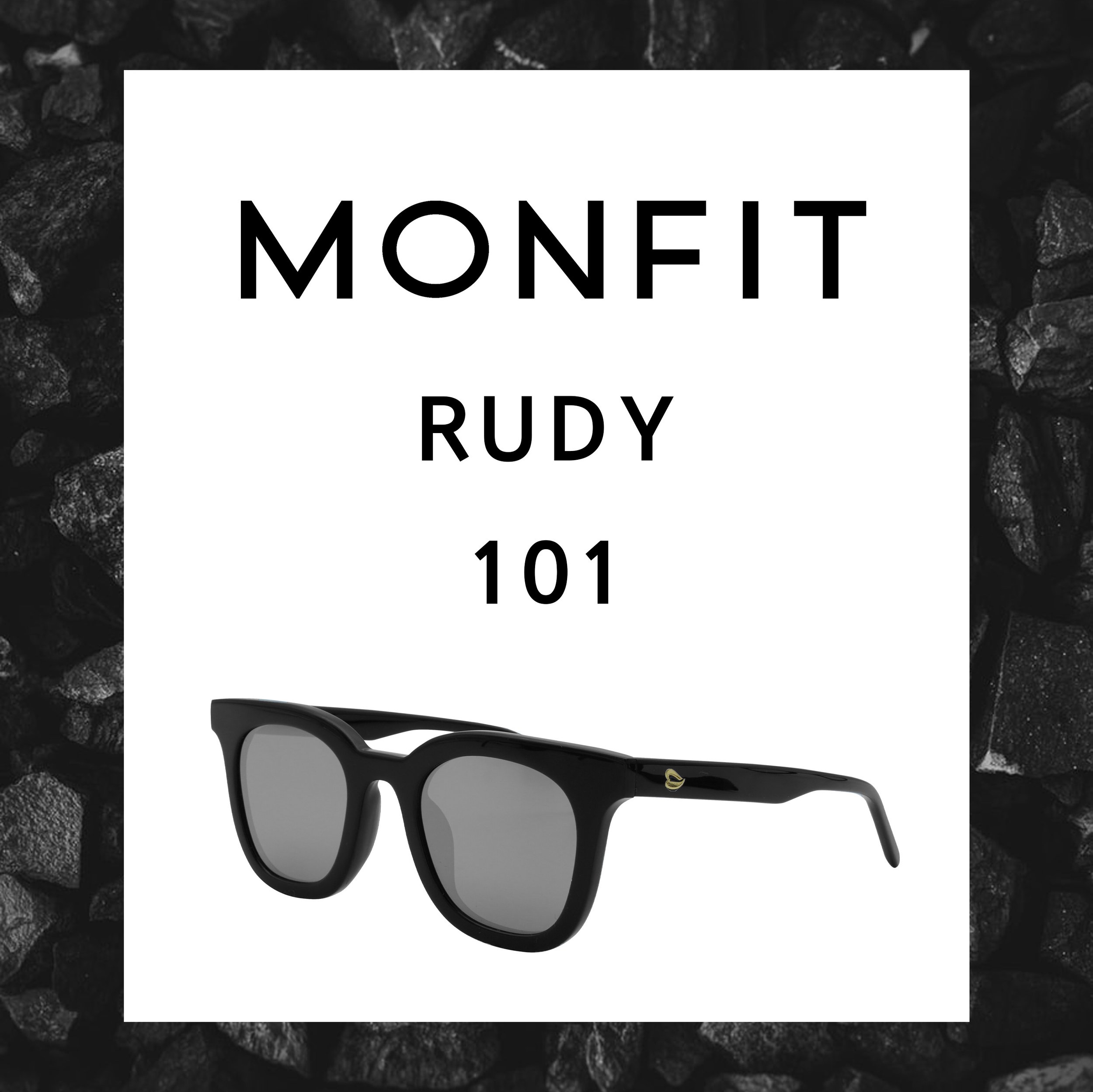
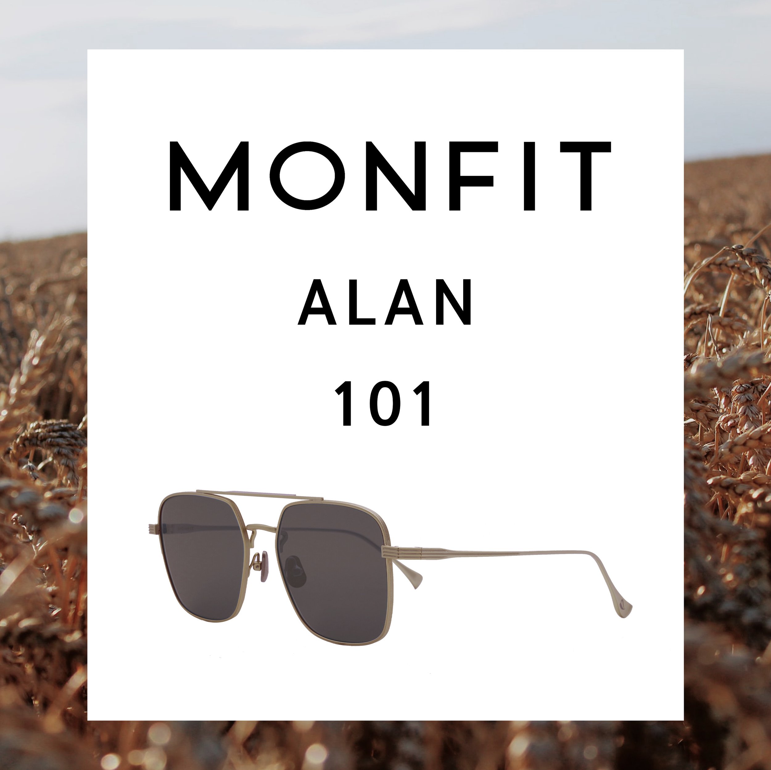
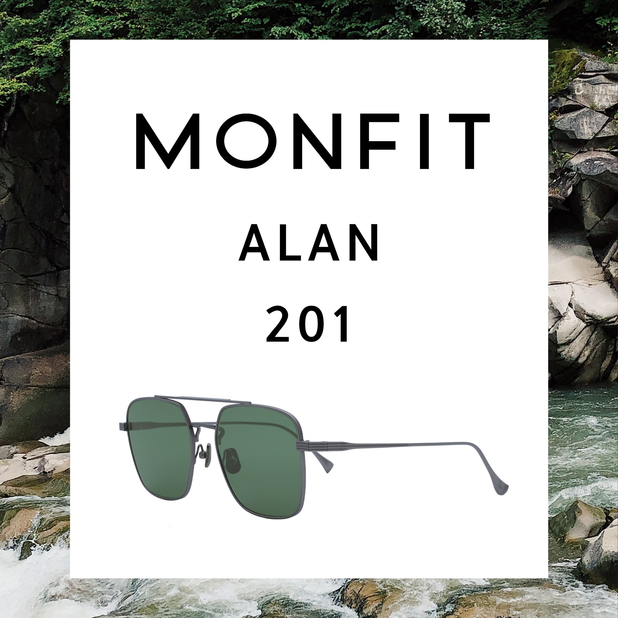
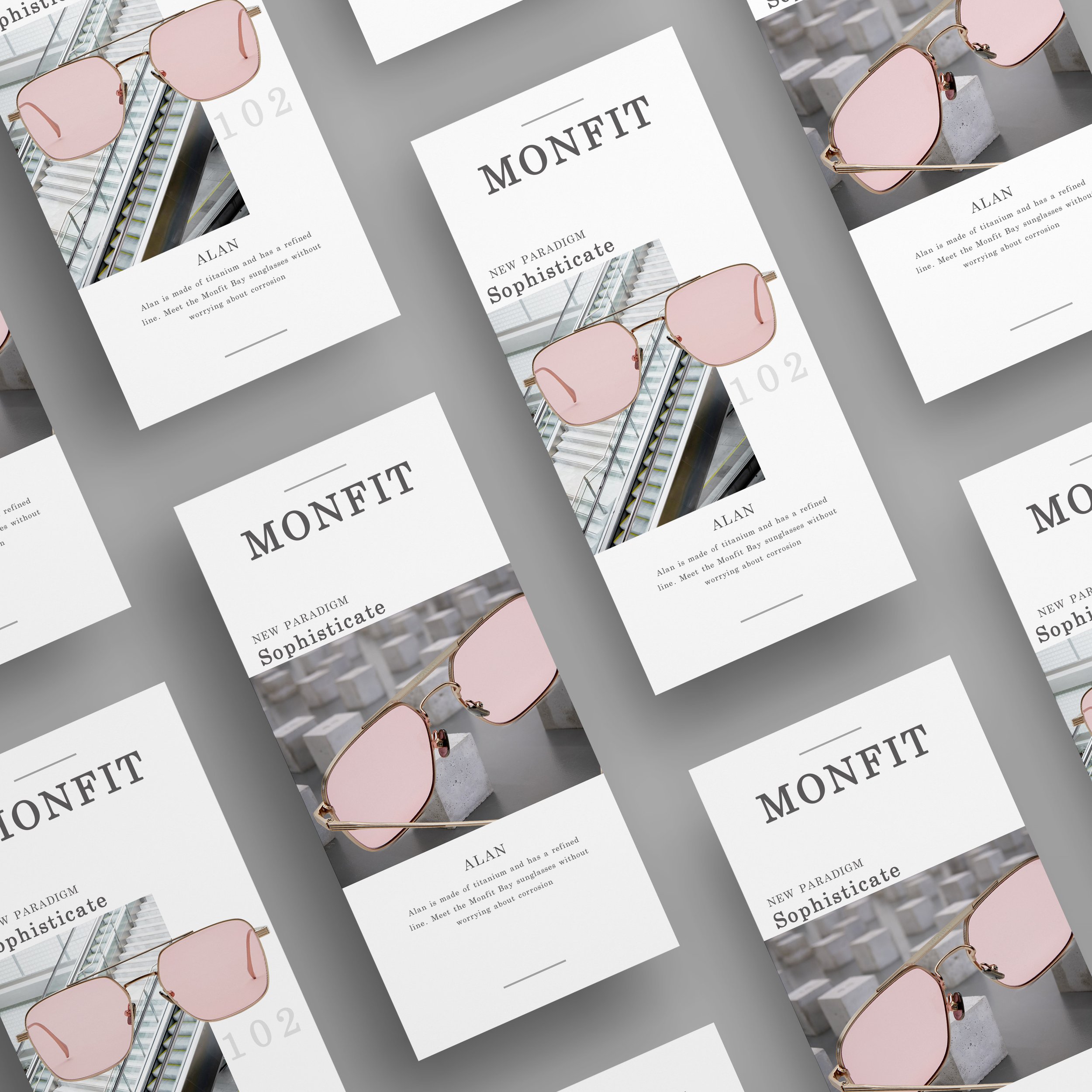
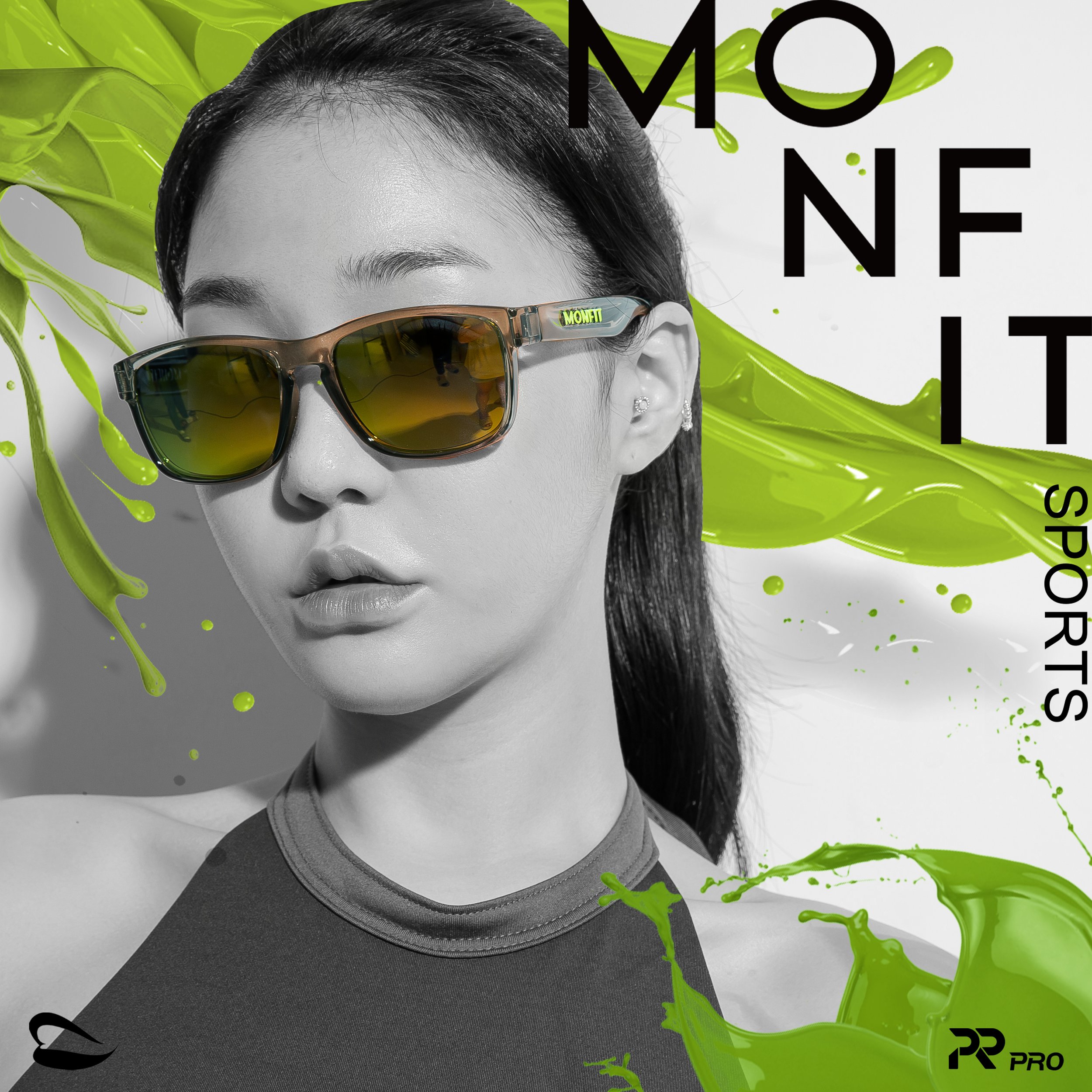
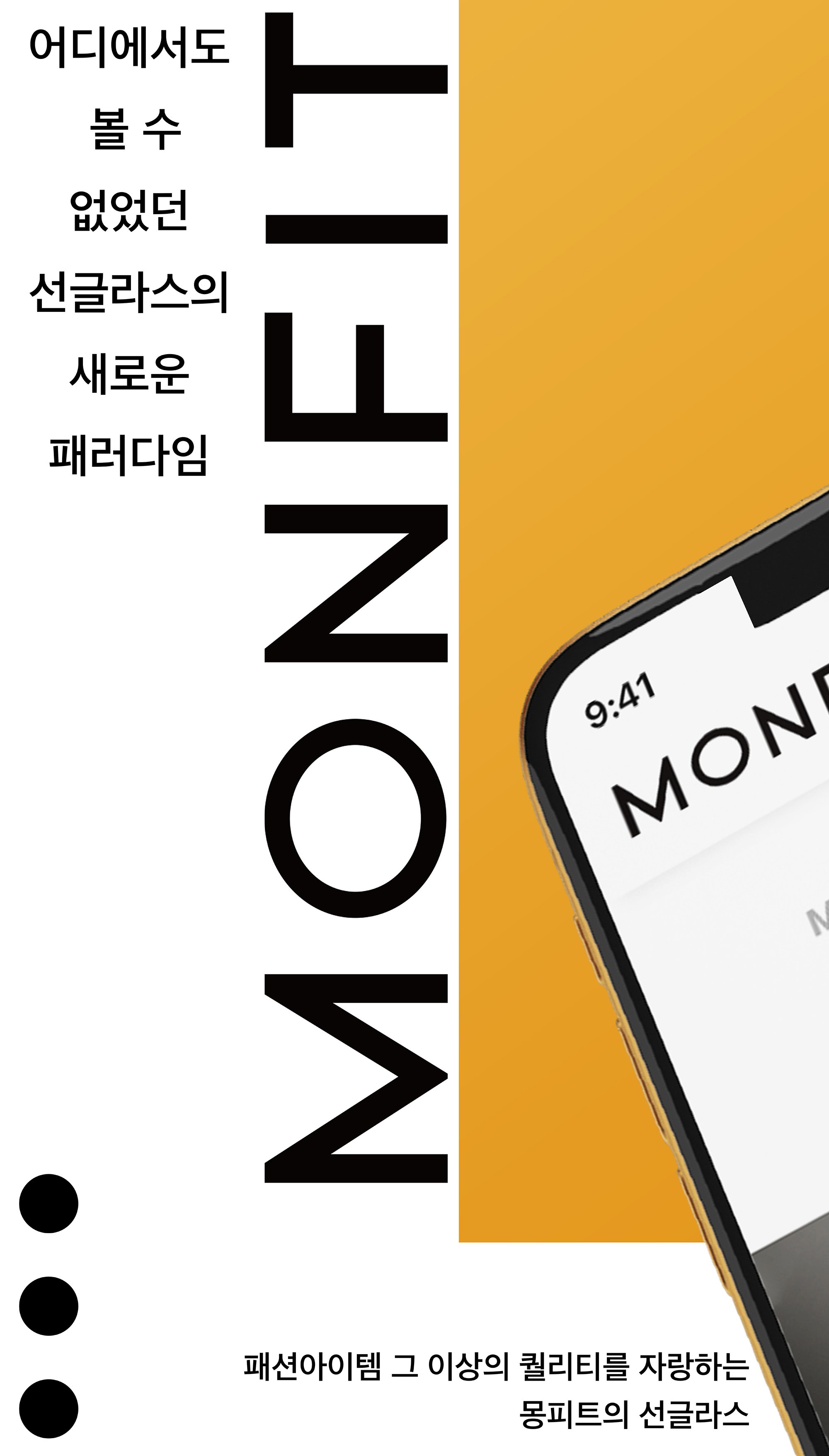
MONFIT
Work Year
2019 – 2020
Brand Description
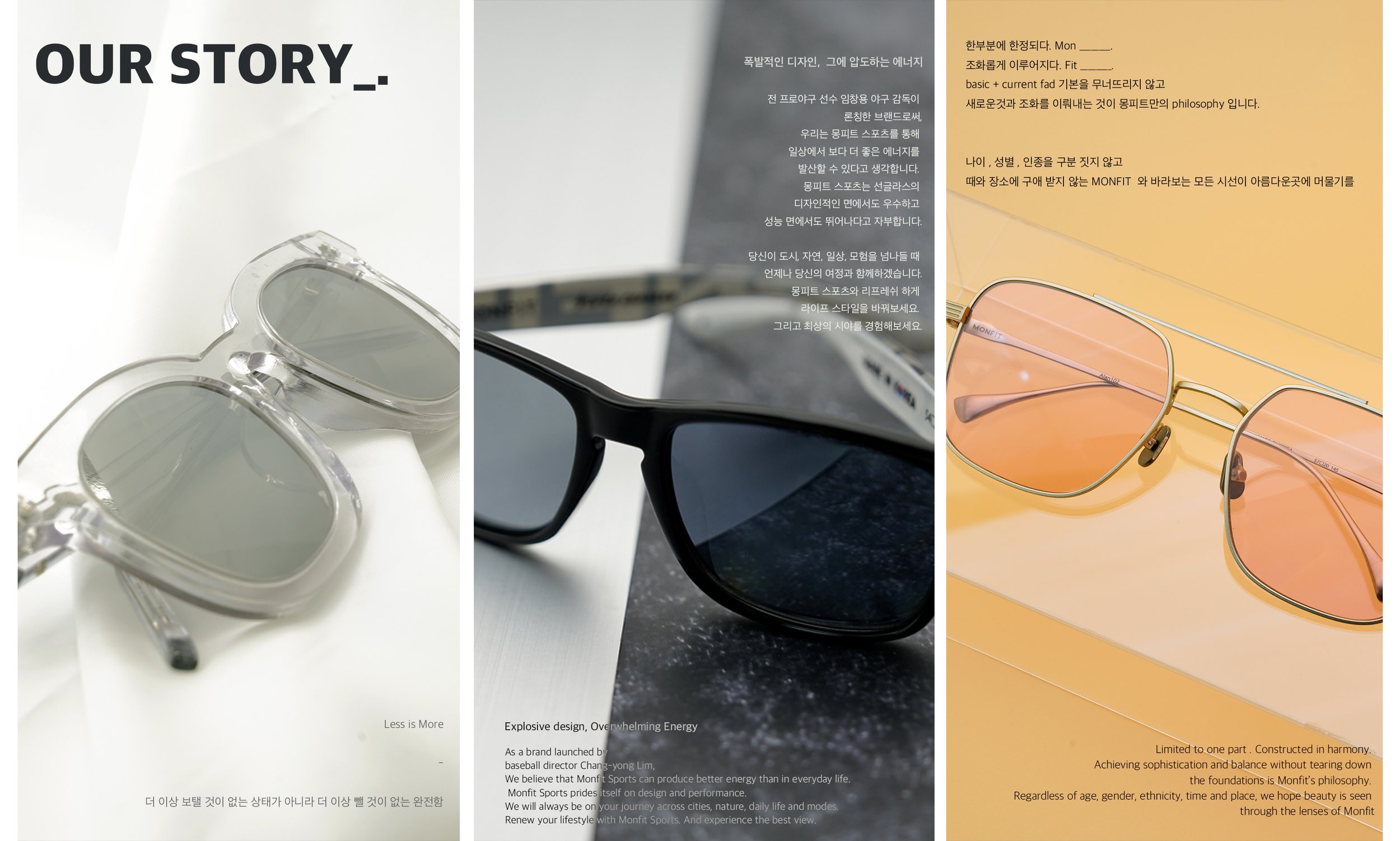
Monfit is a blend of “Mon” (to focus) and “Fit” (to harmonize), embodying a philosophy that balances the essential and the fashionable. The brand challenges conventions while embracing evolving trends, creating a design language that is timeless yet bold.
It is inclusive of all ages, genders, and identities, and adapts effortlessly to any time or place. Every gaze should find beauty—and Monfit ensures it does.
Logo


Brand Concept
A perfect harmony between basics and the current fad, Monfit celebrates confidence, elegance, and versatility. Inspired by Cupid’s golden arrow in Roman mythology, the eyewear collection—Fall Into Temptation—transforms anyone into an icon of allure. With a fusion of sensuality, intellect, and intensity, Monfit seduces through style.
Keywords
Inclusive, Genderless, Timeless, Elegant, Bold, Sensual
Packaging
Website
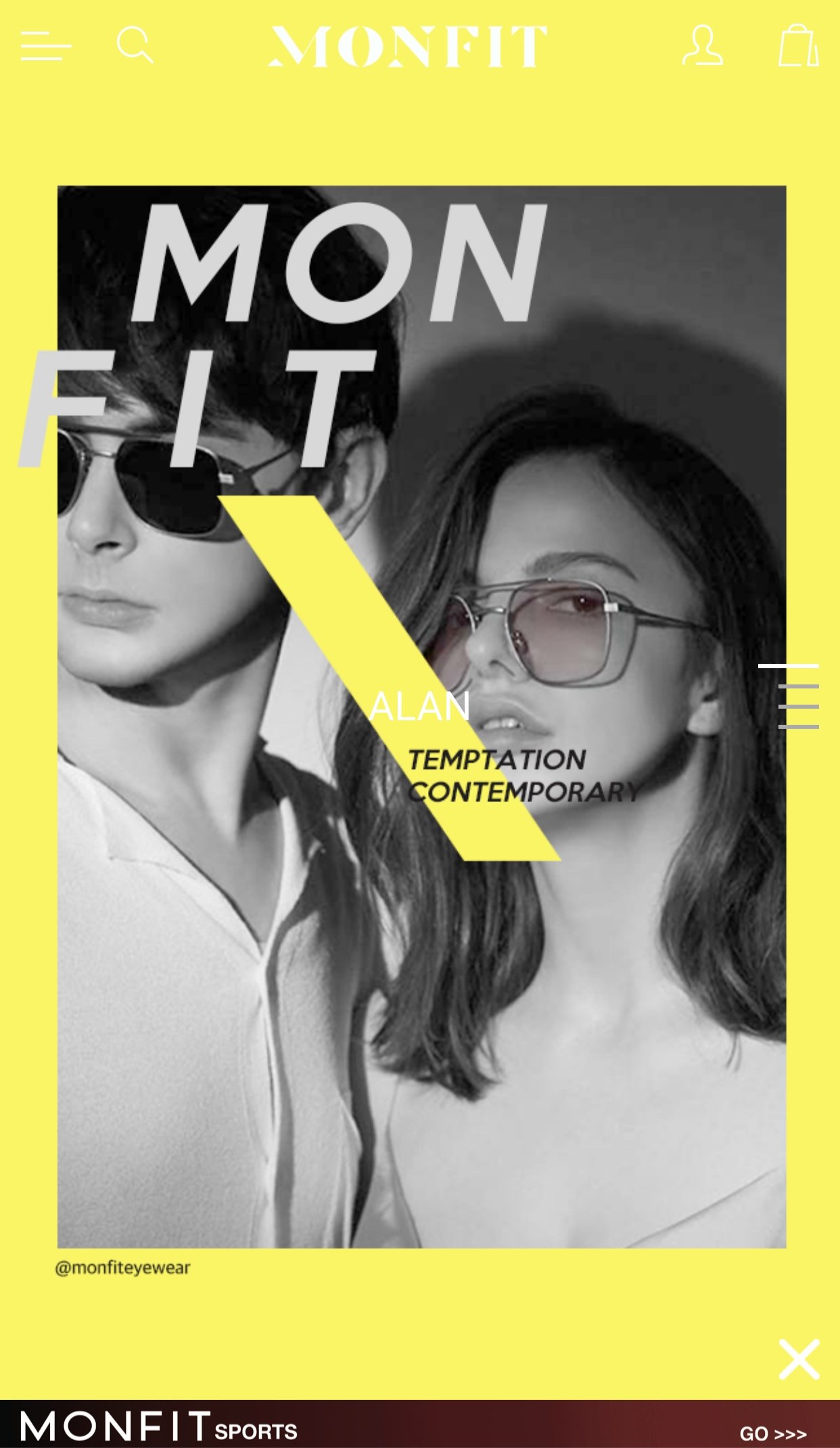
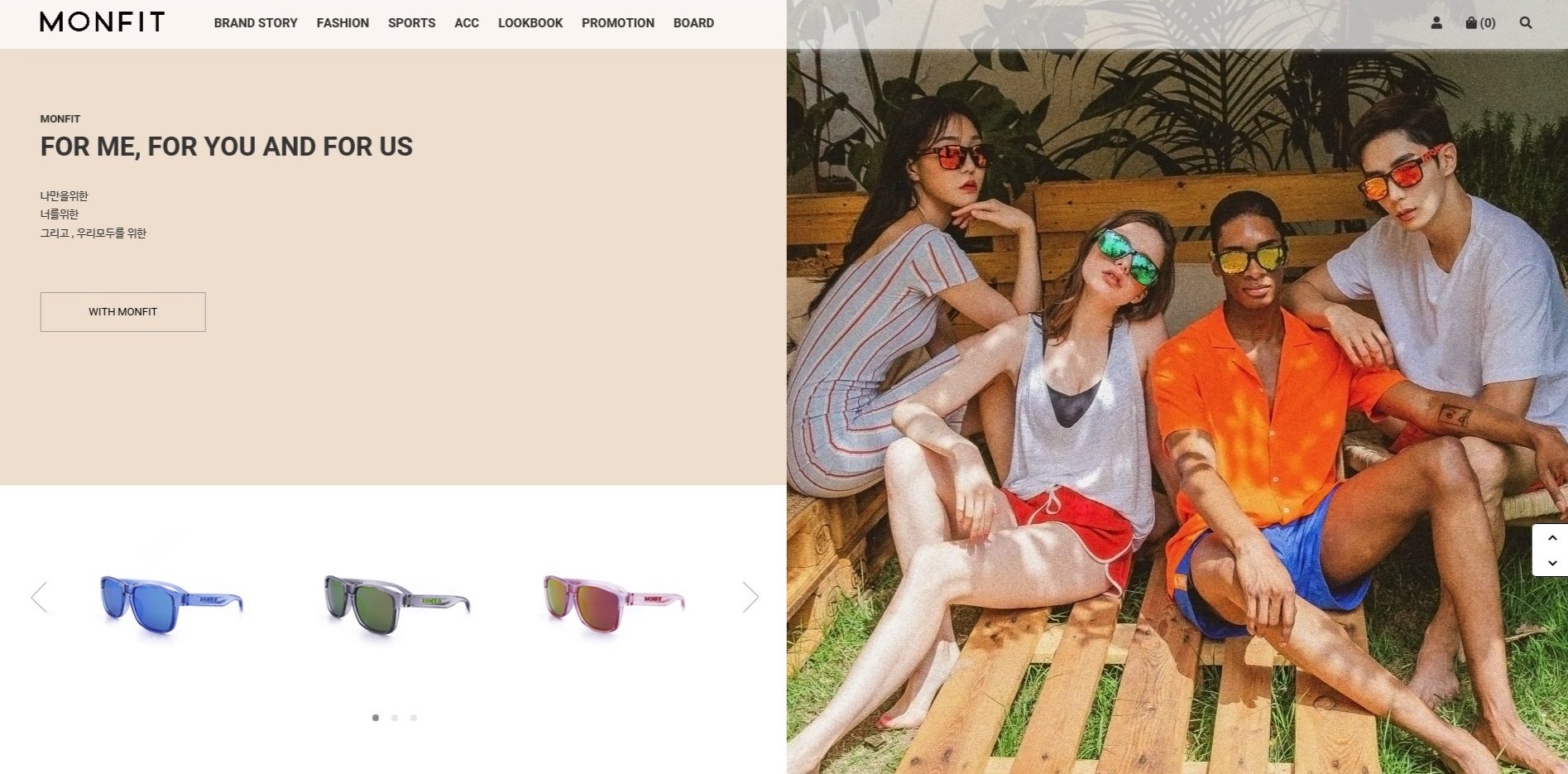
This website was built using Cafe24, a Korean e-commerce platform. I selected and customized a base template, then fully redesigned both PC and mobile versions to align with Monfit’s brand identity.
All modifications were manually coded in HTML by myself, ensuring a seamless, elegant user experience across devices. The design reflects Monfit’s values—bold, inclusive, and timeless.
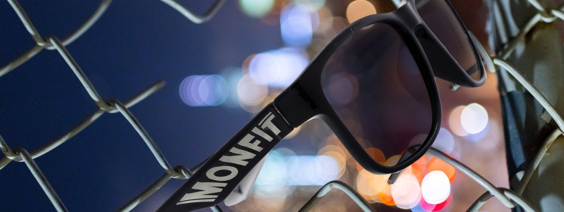
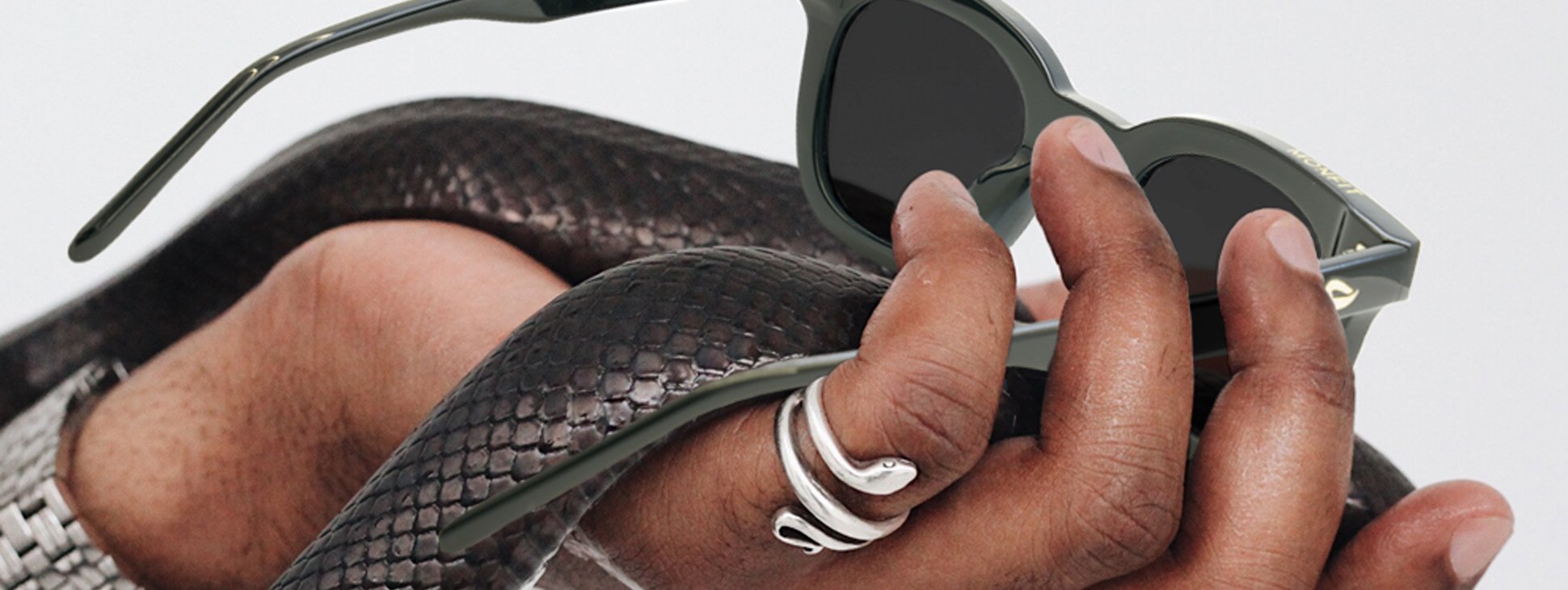
All product photographs were taken by the designer.


PC Version — Banner Collection
Popup Window

Product Detail Page

Popup Window
PC Version — Promotion
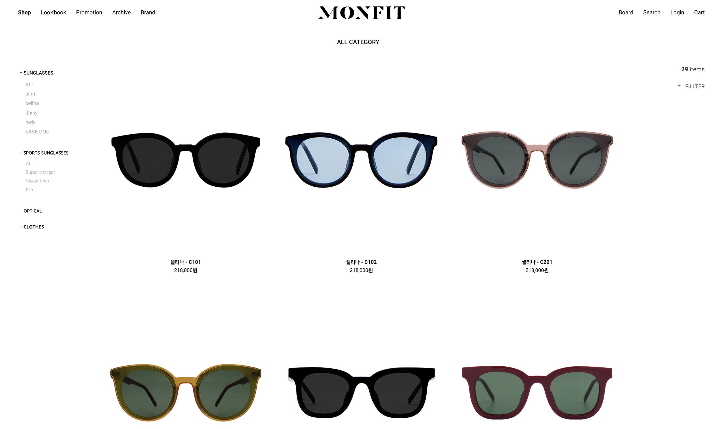
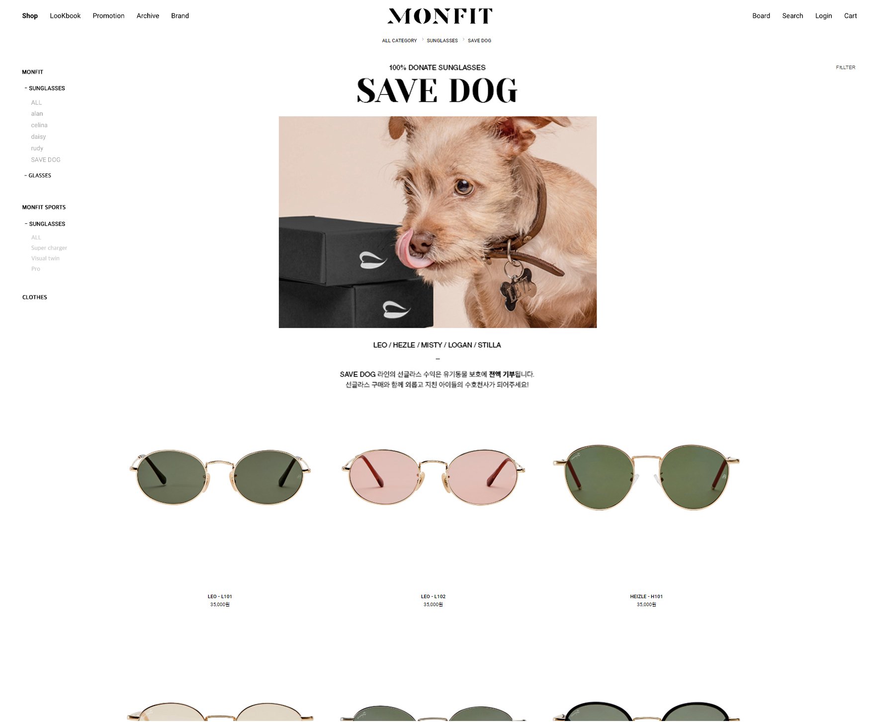
PC Version — Product Overview
PC Version — Brand Story

Popup Window

Popup Window

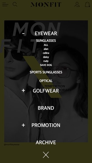
Mobile Version — Lookbook

Mobile Version — Product Detail Page

Mobile Version — Product Detail Page

Mobile Version — Product Overview


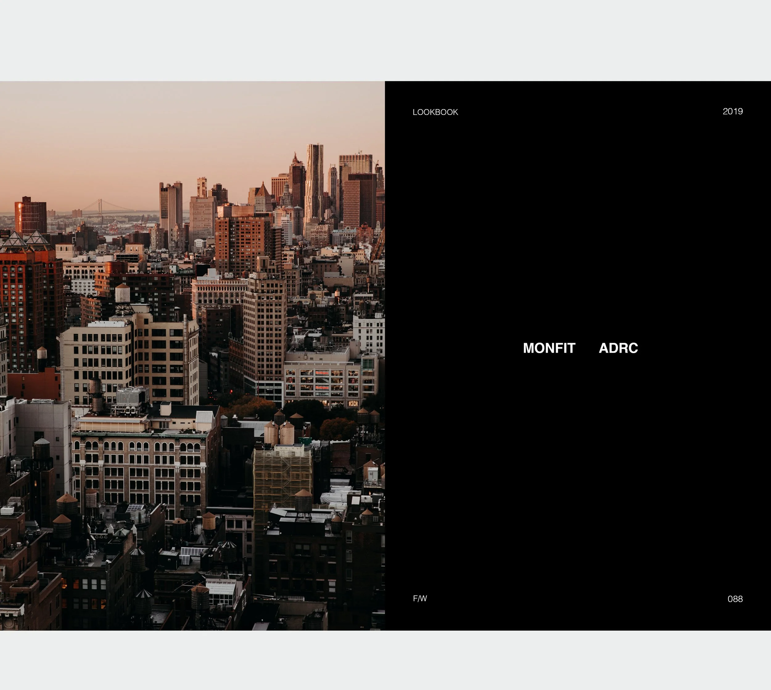


19FW
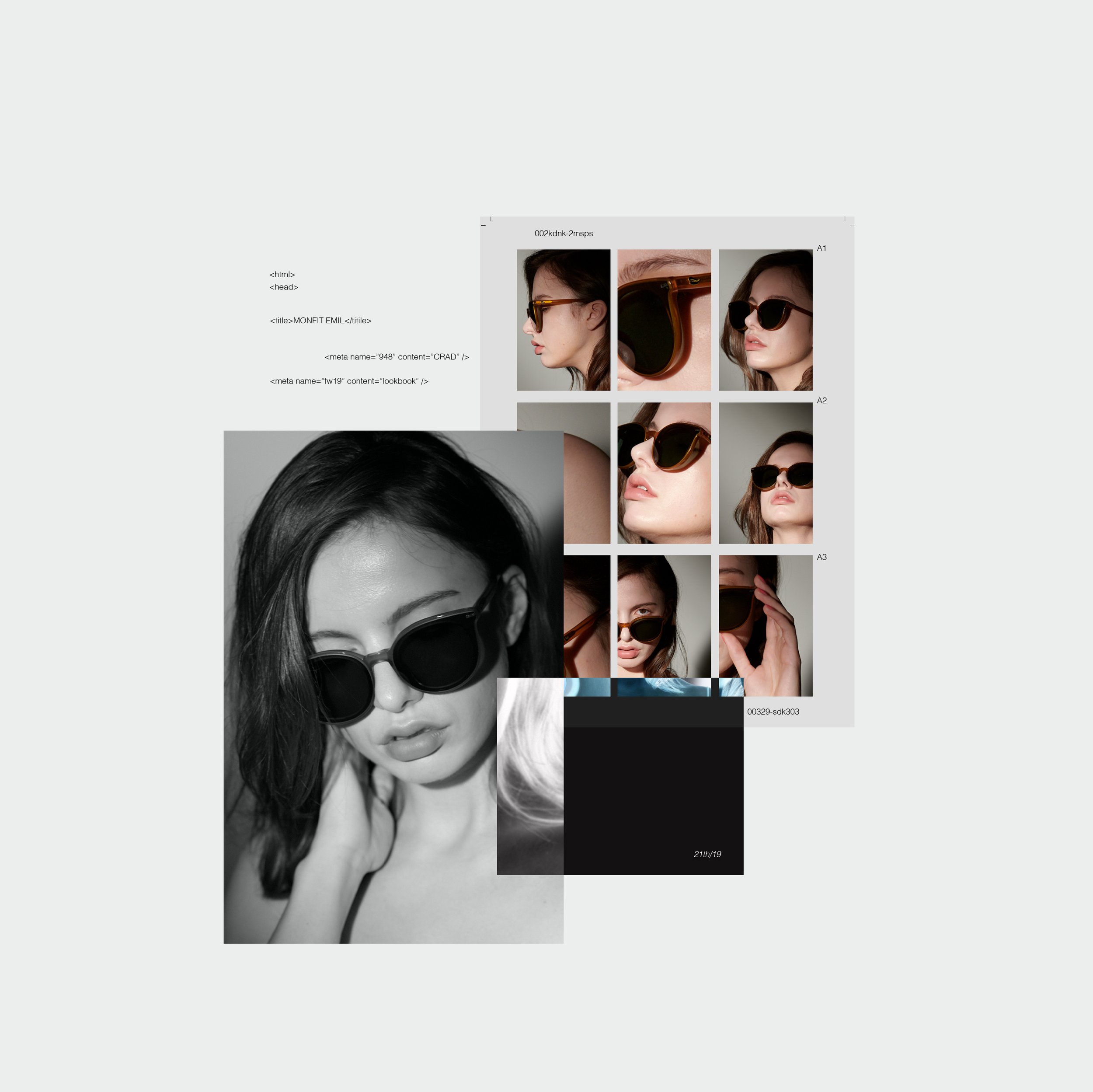
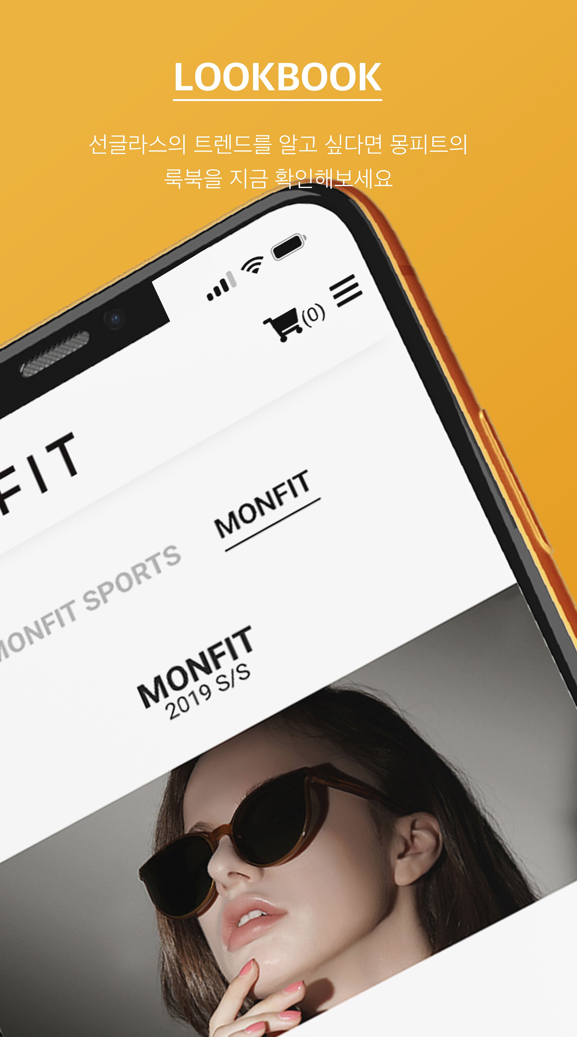
LookBook
This lookbook captures the brand’s visual identity through seasonal storytelling, combining product presentation with editorial photography.
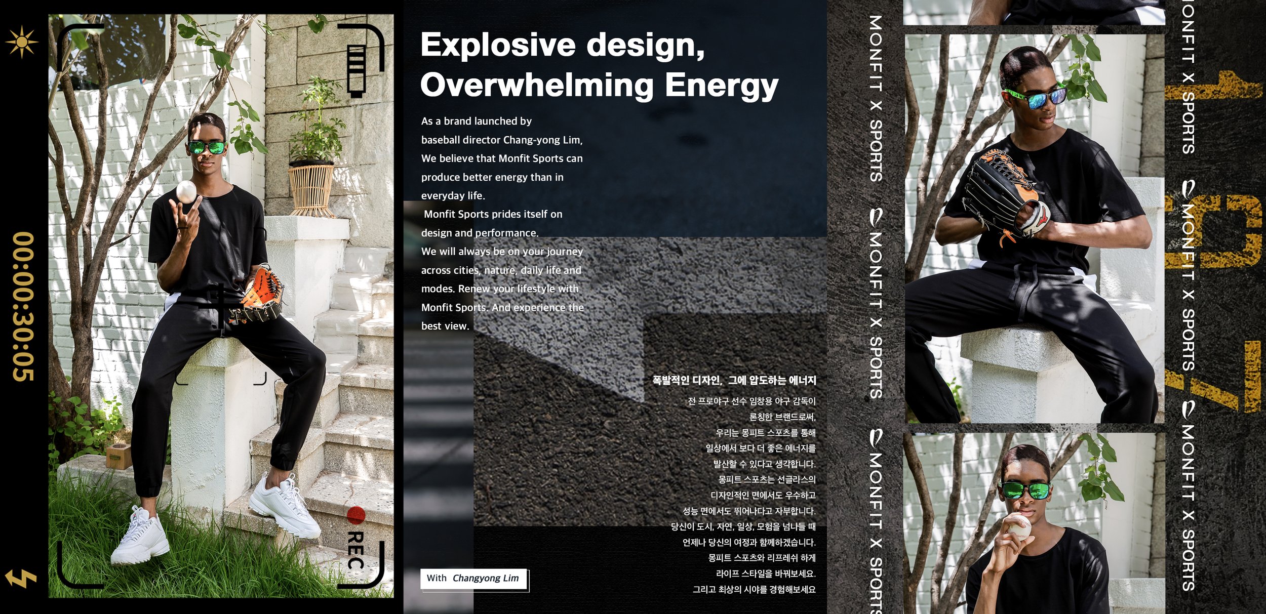
The 2019 Spring/Summer collection embraces a nostalgic warmth—soft tones, casual styling, and candid energy reflecting effortless charm in everyday moments.
The 2019 Fall/Winter series shifts to a cooler, more curated aesthetic. Editorial layouts, experimental typography, and layered compositions express a bold, contemporary narrative that aligns with Monfit’s fashion-forward spirit.
Each layout was designed and art-directed by the designer to communicate not just product features, but mood, context, and cultural tone.
19SS

Instagram Content
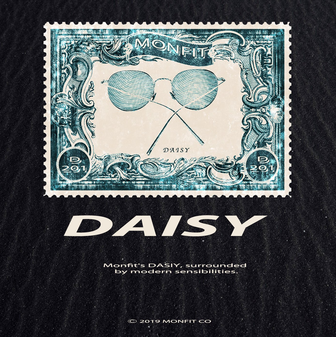
A series of curated visuals crafted for Monfit’s Instagram feed. These posts emphasize product identity and lifestyle storytelling through bold typography, vibrant color palettes, and composition that highlights the eyewear’s unique charm. Each design aims to reinforce brand consistency while engaging viewers with modern, eye-catching aesthetics.


Catalogue
This catalogue presents a comprehensive overview of Monfit’s eyewear collections, featuring product specifications, color variations, and model imagery. Each layout is designed for clarity and visual balance, combining clean typography with striking portraits.
The catalogue not only functions as a sales tool but also reinforces Monfit’s brand identity—stylish, inclusive, and detail-oriented—through consistent visual language and professional presentation.


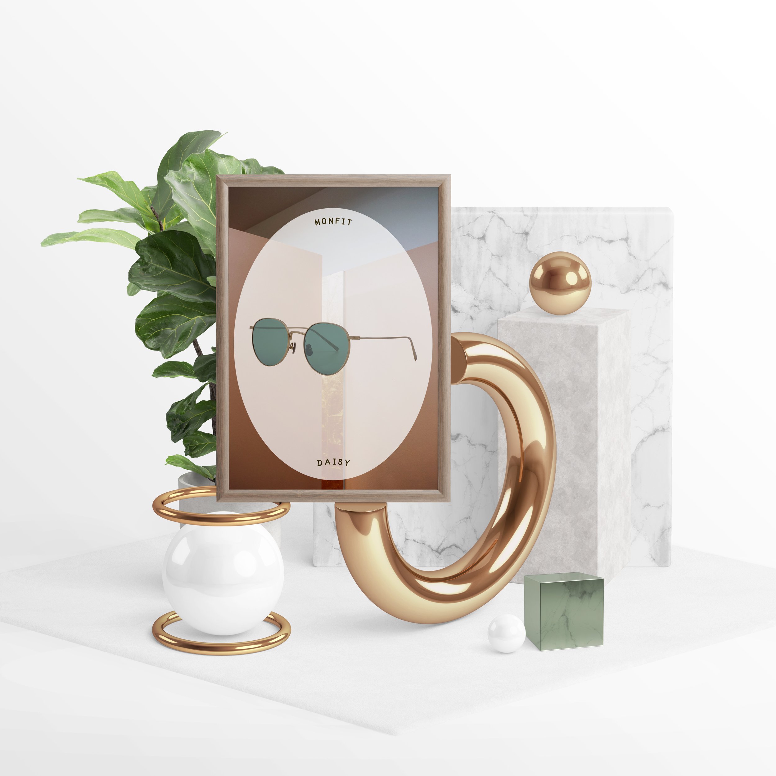
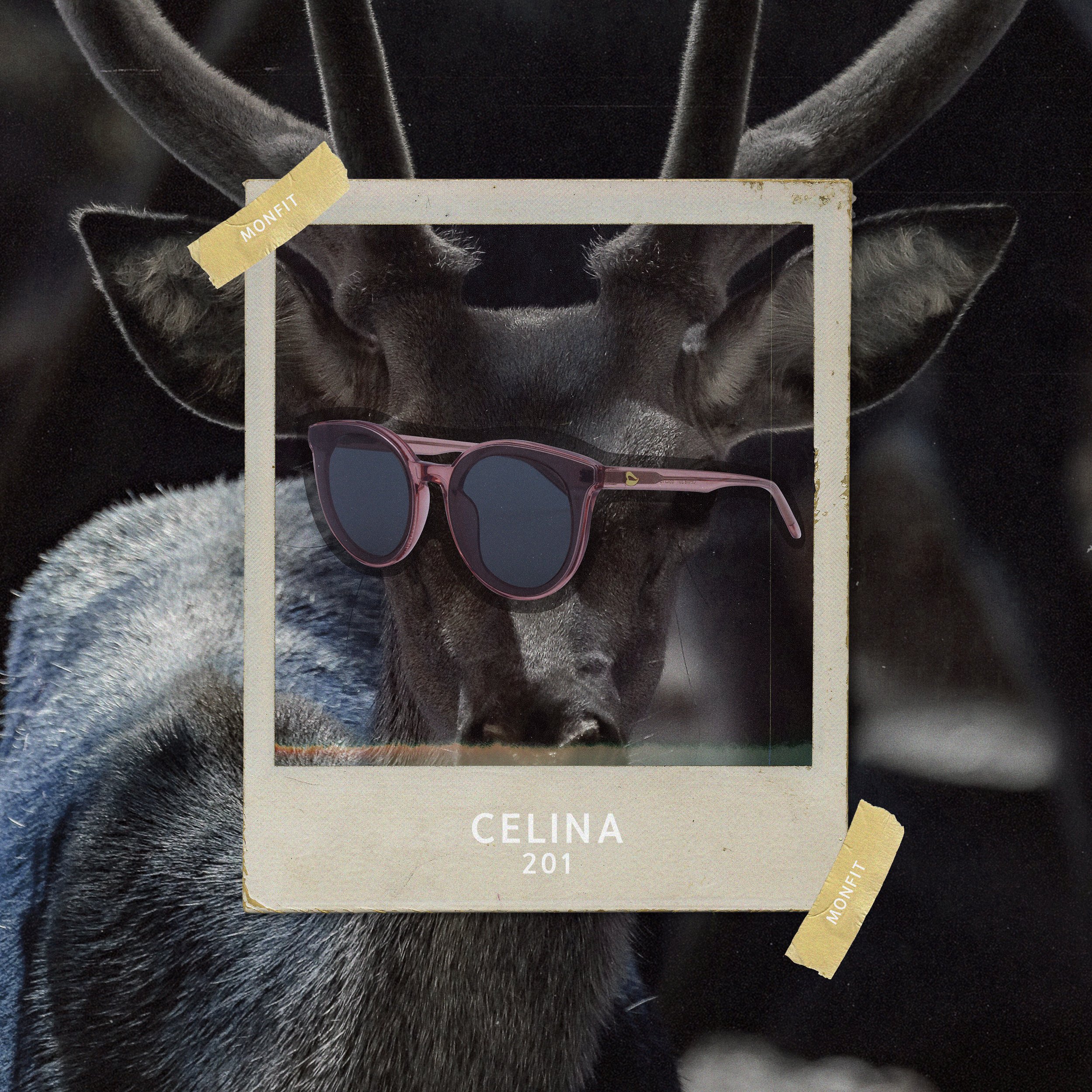
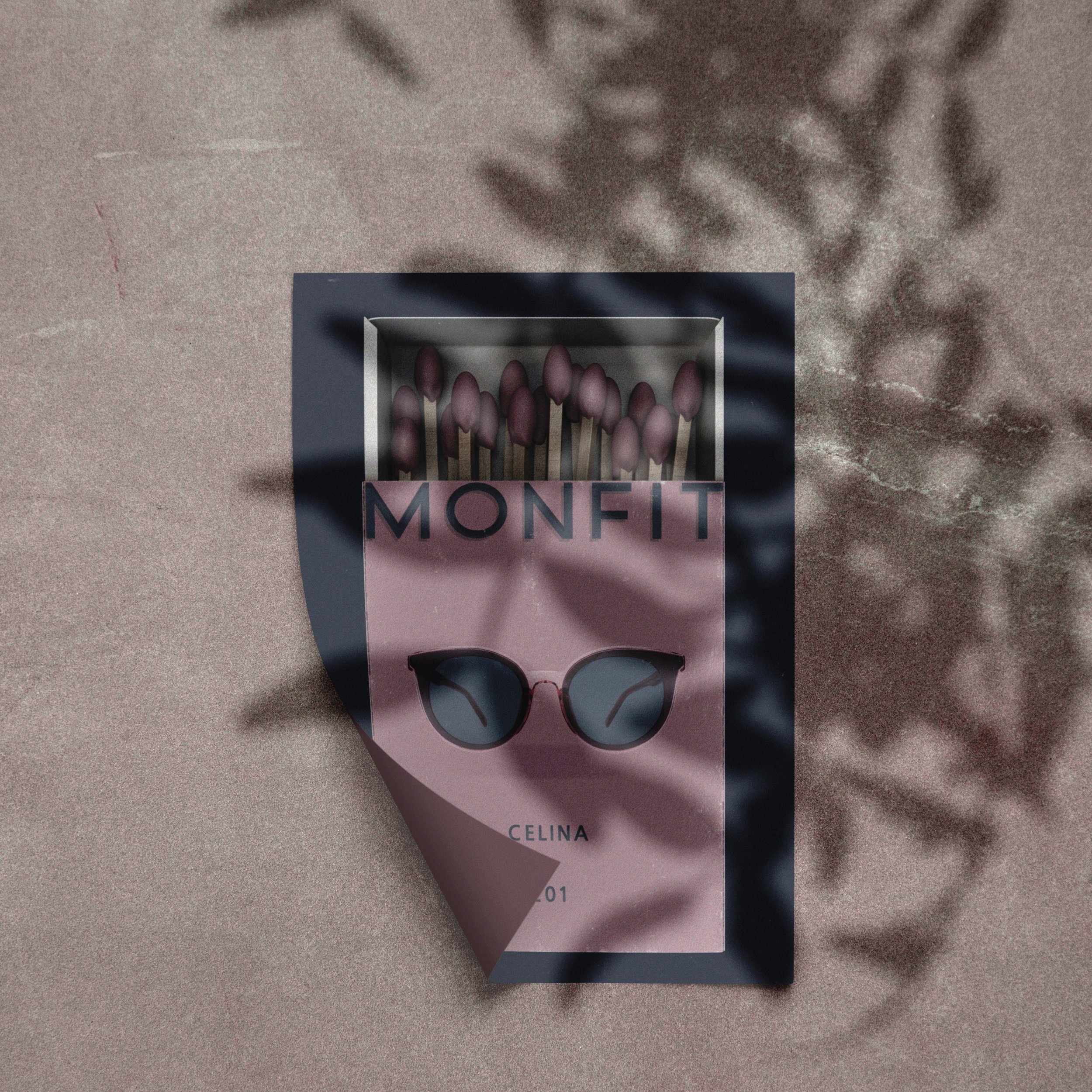
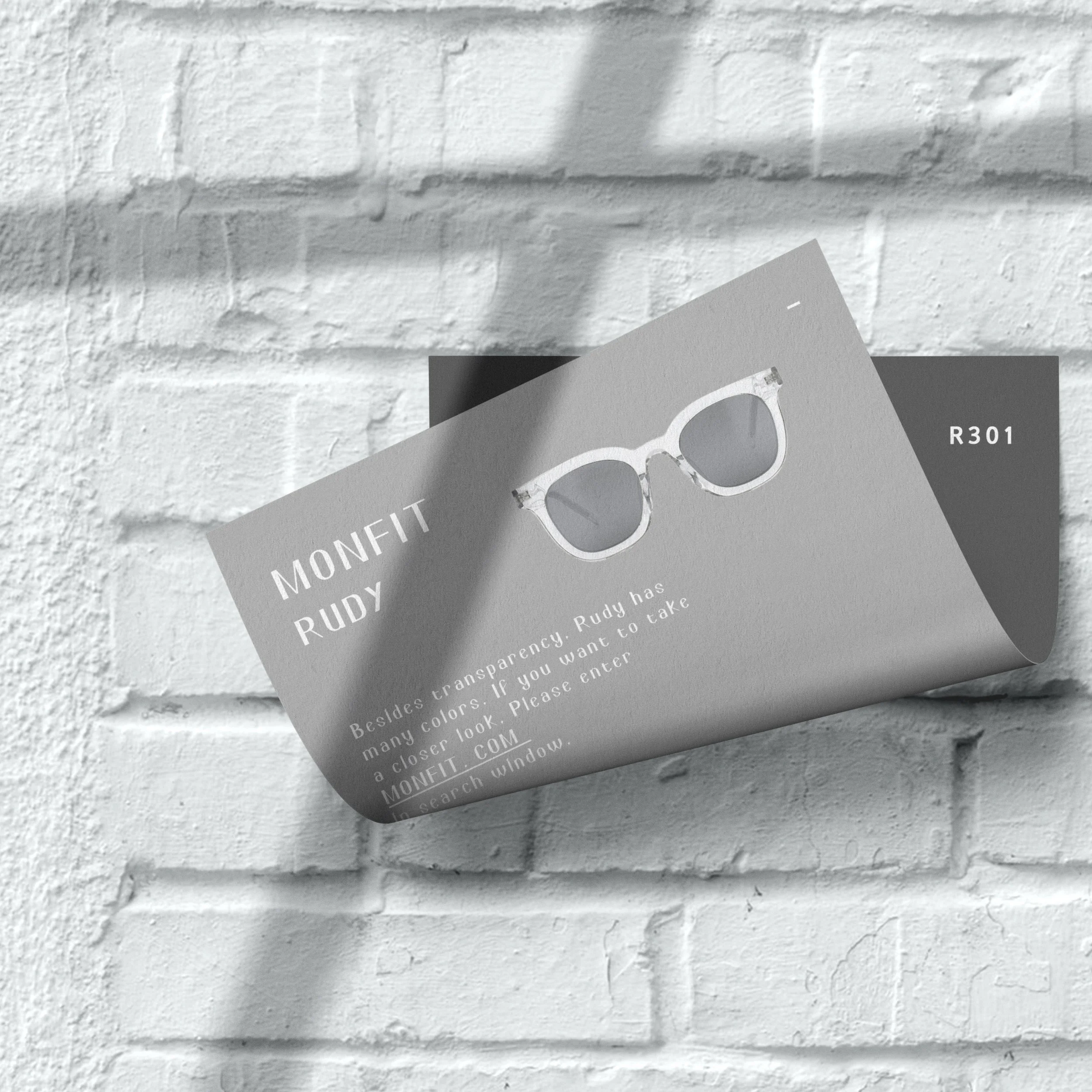
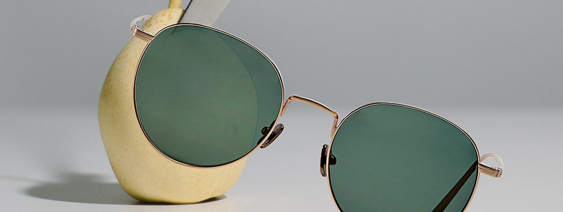
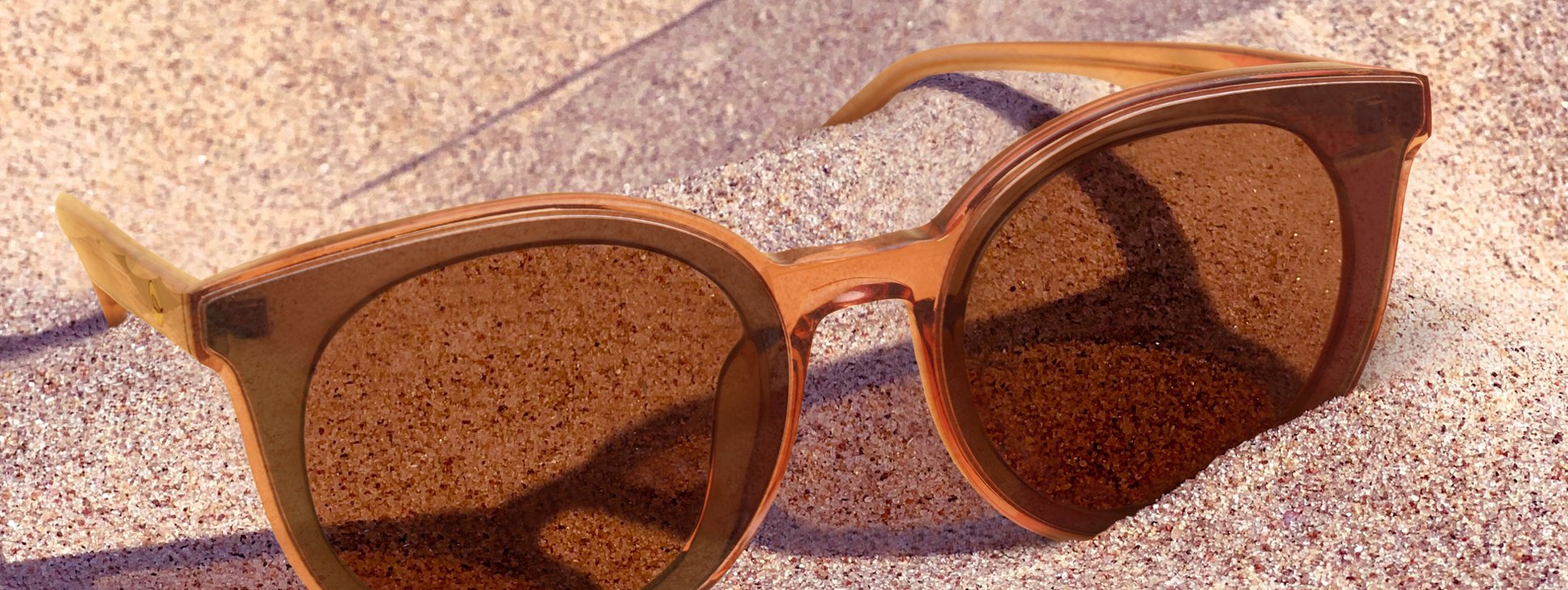
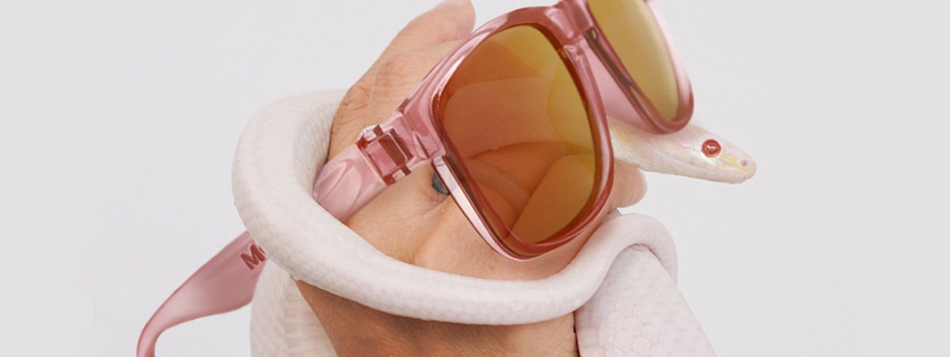
Composited Product Visuals
This series showcases conceptual product visuals created through photo compositing. By blending eyewear with unexpected textures and environments—such as fruit surfaces, ocean scenes, and sandy landscapes—these images present the products in a surreal, artistic context. The aim is to spark curiosity and elevate the brand beyond conventional product shots, transforming each frame into a statement of style and imagination.


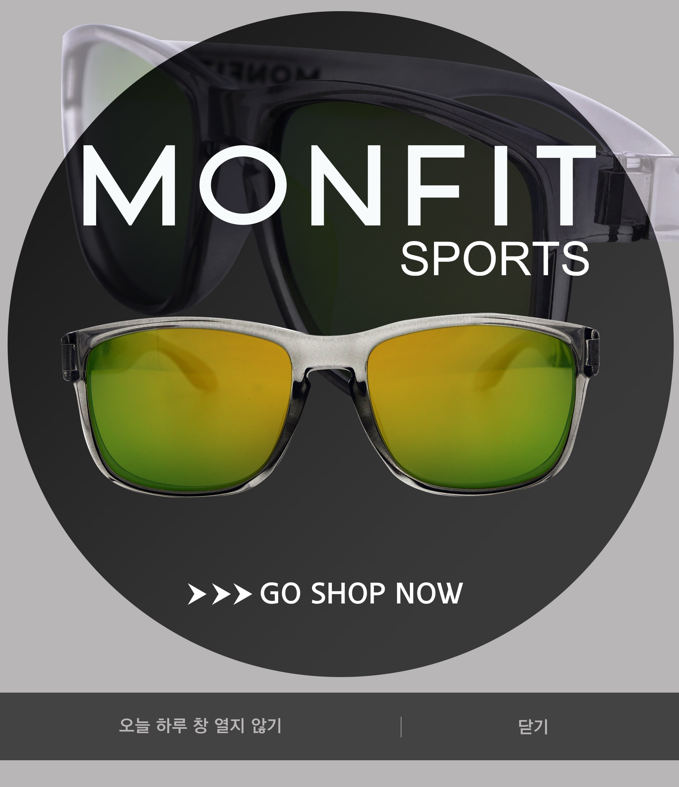
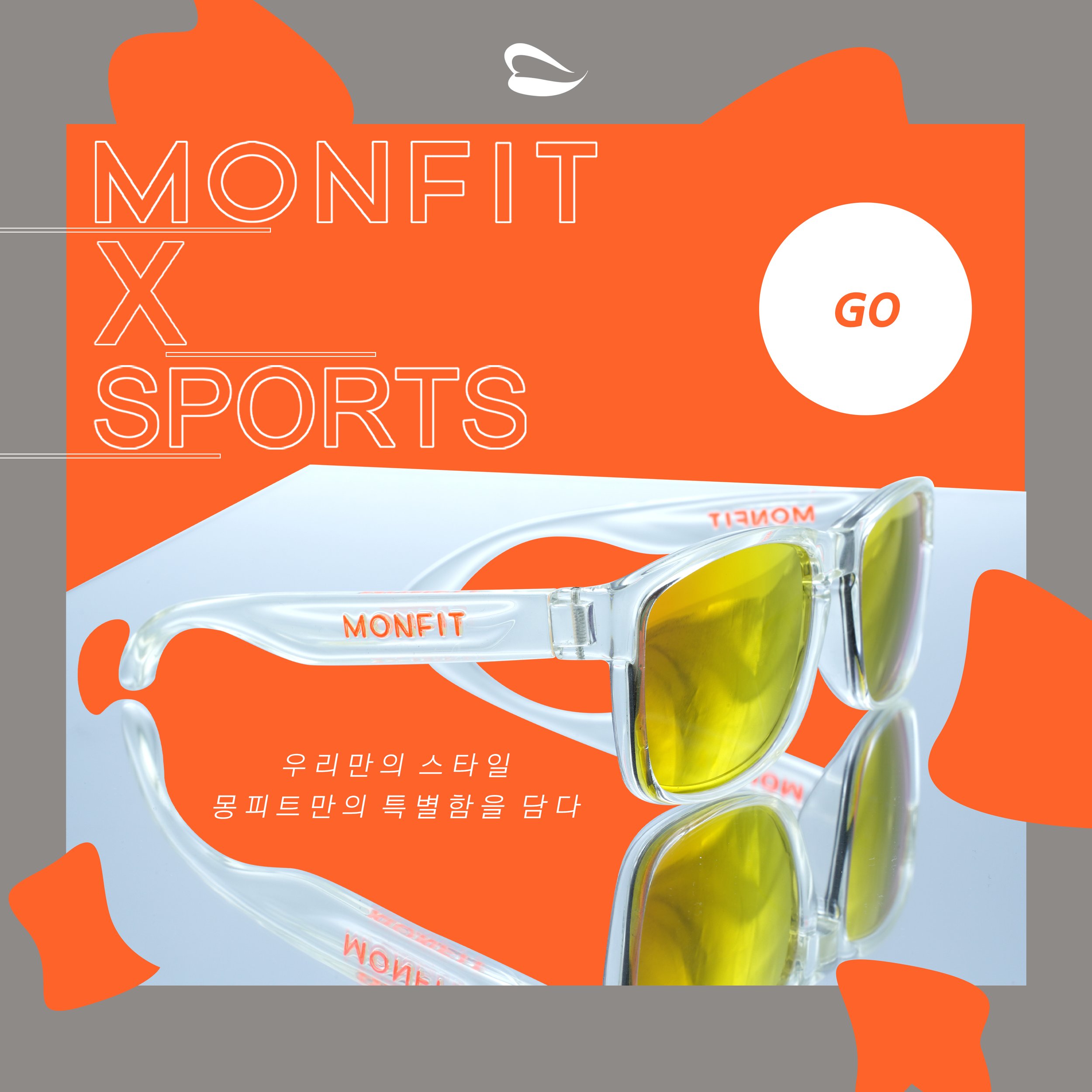
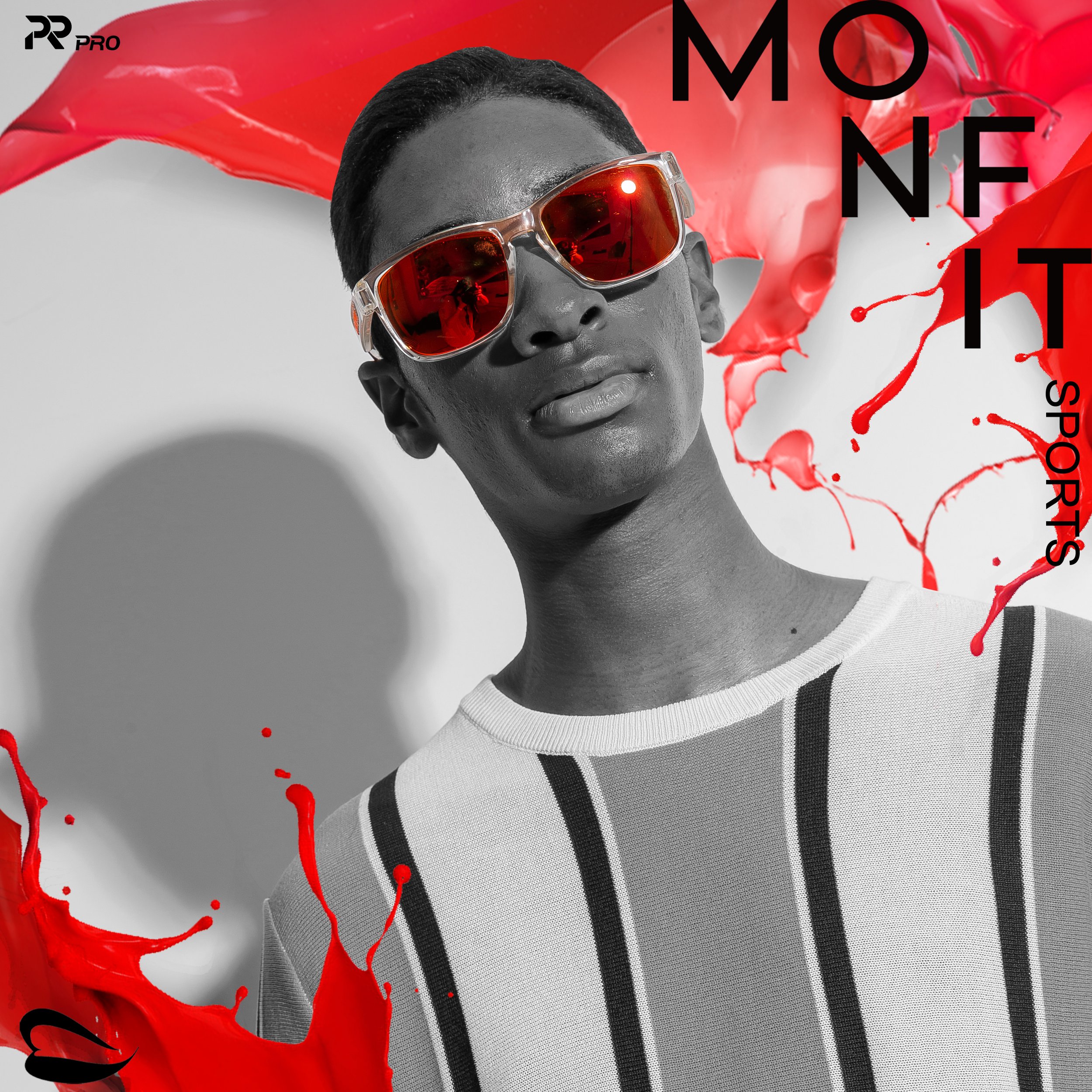
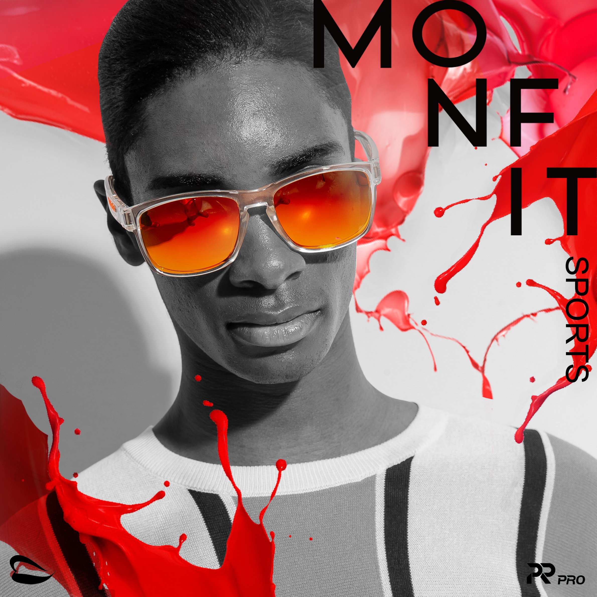
MONFIT SPORTS
Work Year
2019 – 2020
Brand Description
Monfit Sports is a performance eyewear brand derived from Monfit, launched by former professional baseball player and coach Chang-Yong Lim. Rooted in a belief that good energy begins with everyday comfort, Monfit Sports offers sunglasses that excel in both design and functionality. Whether you’re navigating the city, immersing yourself in nature, or pushing your limits through adventure, Monfit Sports is built to accompany every step of your lifestyle journey.
Logo


Brand Concept
Refresh your lifestyle with Monfit Sports—where high-performance meets modern style. Our eyewear merges aesthetic sophistication with technical precision to deliver the clearest, most comfortable vision. With Monfit Sports, see more, move better, and live fully.
Keywords
Performance, Active, Urban to Outdoor, Energetic, Stylish, Functional, Refreshing
Packaging
Website
This website was built using Cafe24, a Korean e-commerce platform. I selected and customized a base template, then fully redesigned both PC and mobile versions to align with Monfit’s brand identity.
All modifications were manually coded in HTML by myself, ensuring a seamless, elegant user experience across devices. The design reflects Monfit’s values—bold, inclusive, and timeless.
All product photographs were taken by the designer.
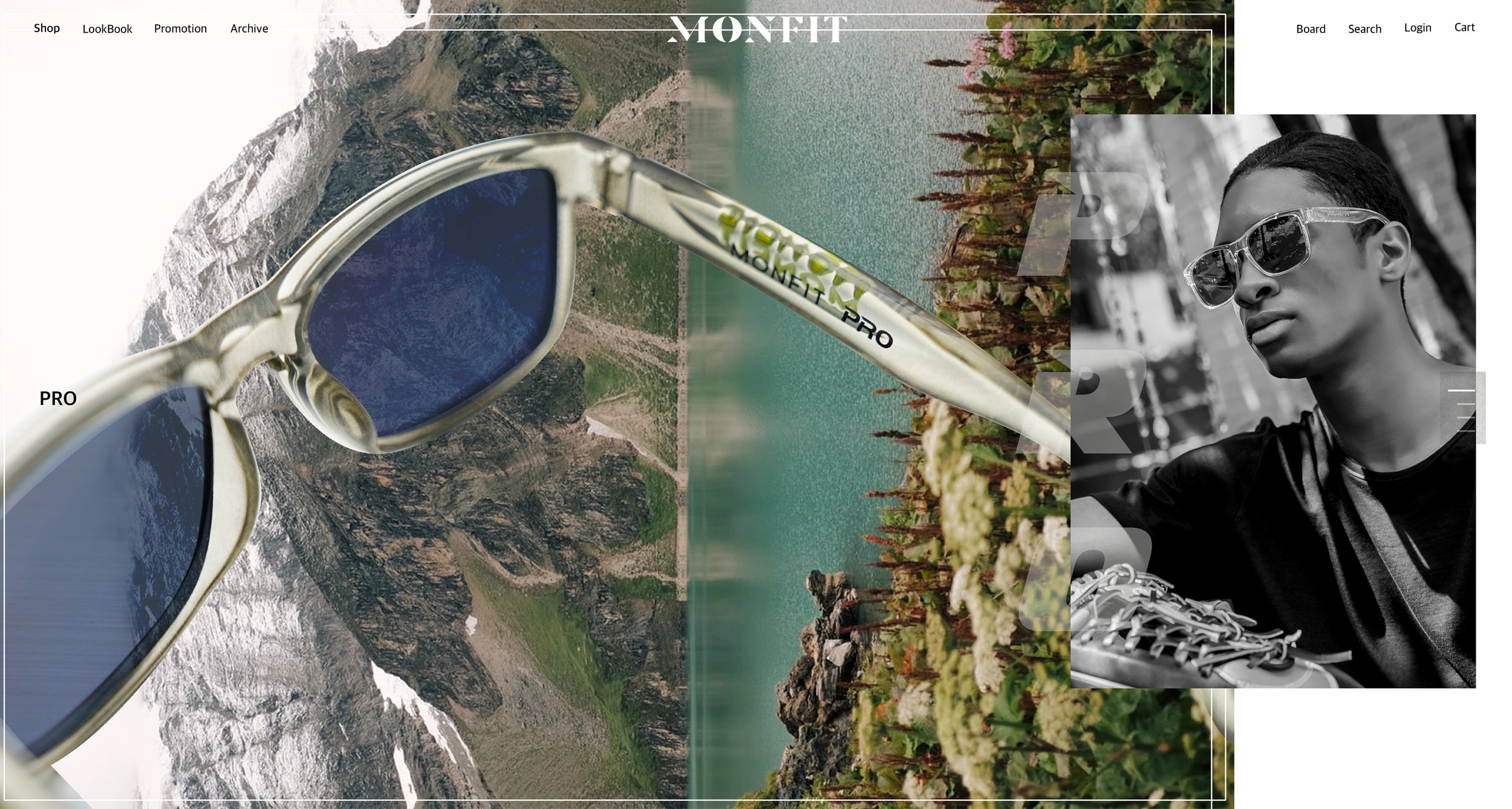

PC Version

Product Detail Page

Product Detail Page

Product Detail Page

Popup Window

Product Detail Page

Popup Window
Popup Window

Popup Window
Popup Window
Popup Window
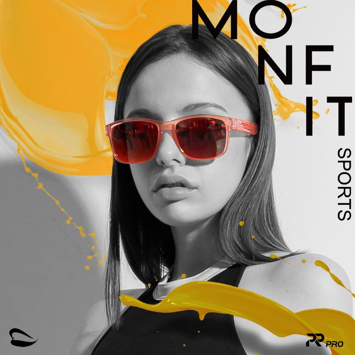
Instagram Content
A series of curated visuals crafted for Monfit’s Instagram feed. These posts emphasize product identity and lifestyle storytelling through bold typography, vibrant color palettes, and composition that highlights the eyewear’s unique charm. Each design aims to reinforce brand consistency while engaging viewers with modern, eye-catching aesthetics.


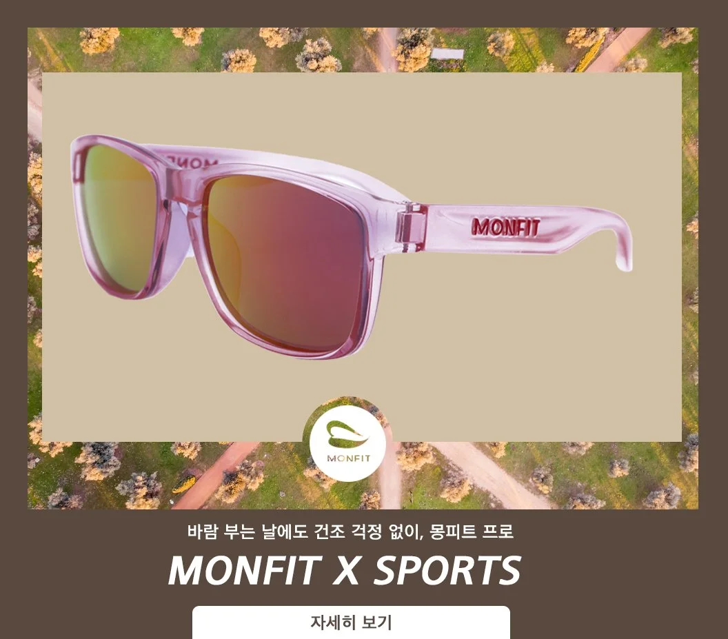
Catalogue
This catalogue presents a comprehensive overview of Monfit’s eyewear collections, featuring product specifications, color variations, and model imagery. Each layout is designed for clarity and visual balance, combining clean typography with striking portraits.
The catalogue not only functions as a sales tool but also reinforces Monfit’s brand identity—stylish, inclusive, and detail-oriented—through consistent visual language and professional presentation.

Composited Product Visuals
This series showcases conceptual product visuals created through photo compositing. By blending eyewear with unexpected textures and environments—such as fruit surfaces, ocean scenes, and sandy landscapes—these images present the products in a surreal, artistic context. The aim is to spark curiosity and elevate the brand beyond conventional product shots, transforming each frame into a statement of style and imagination.

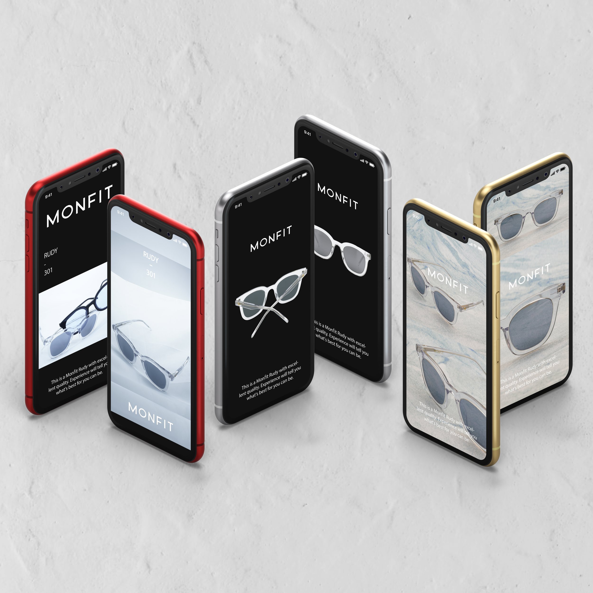
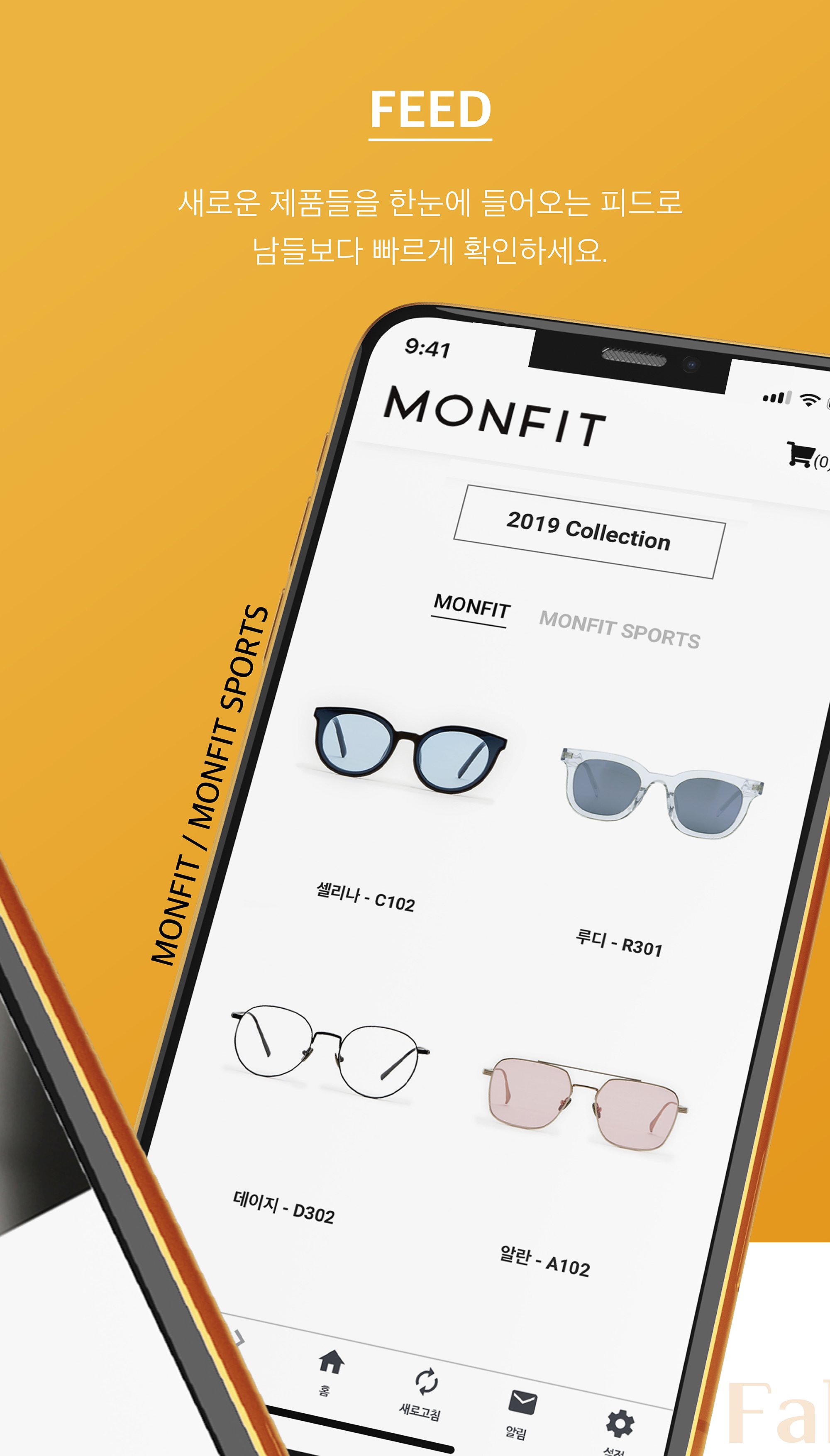
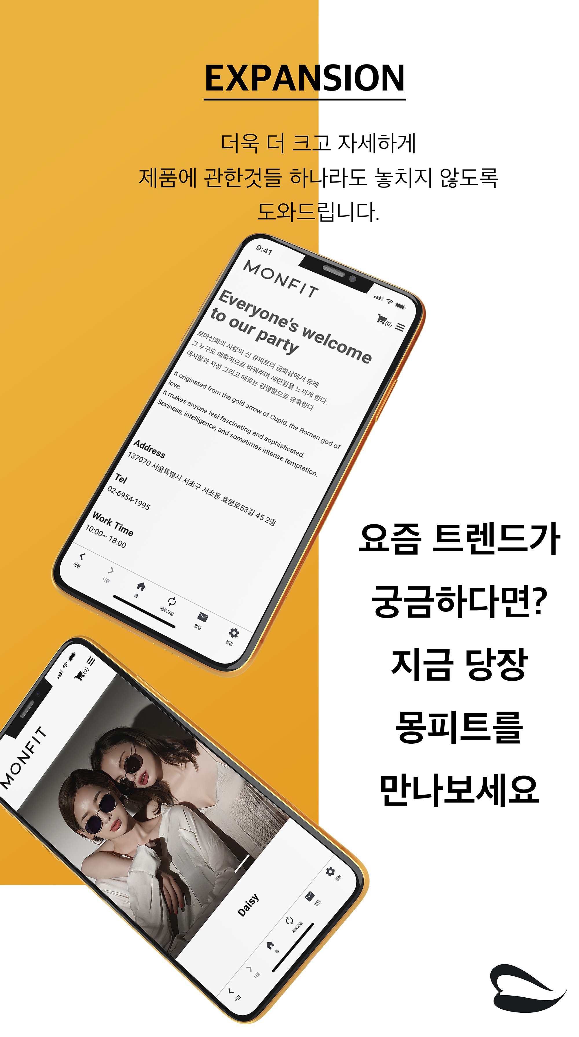
App Splash & UI Integration
This project showcases the unified mobile application interface for Monfit and Monfit Sports, merging both brands into a single cohesive platform.
The splash and preview screens emphasize ease of navigation, stylish product browsing, and a seamless shopping experience, aligning with Monfit’s values of accessibility, elegance, and trend-forward design.
Key UI sections—Lookbook, Feed, Category, and Expansion—highlight the app’s functionality and aesthetic direction. Each screen is crafted to guide users through both fashion discovery and product detail with clarity and visual consistency.


Arco manièra
Work Year
2020
Brand Description
Arco manièra is a fashion label inspired by classical sculptures and architectural forms. Each garment is designed as a wearable piece of art, blending historical imagery with a bold, contemporary sensibility. Through graphic layering, spatial disruption, and sculptural placement, the brand reimagines clothing as a mobile canvas—an expressive medium that reflects the wearer’s identity.
Logo


Brand Concept
“Wearable Sculpture”
The collection merges classical aesthetics with futuristic reinterpretation. Iconic statues, celestial bodies, and structural motifs are deconstructed and reconstructed across the garments, resulting in a fragmented yet cohesive visual language. Arco manièra explores the intersection of form and function, where fashion becomes both statement and structure.
Keywords
• Sculptural
• Classical x Futuristic
• Fragmented Aesthetic
• Visual Boldness
• Wearable Art
• Conceptual Clothing

NPC Company
Work Year
2020
Brand Description
NPC Company is a creative media platform specializing in MCN (Multi Channel Networks). Focused on bridging the gap between content creators and consumers, NPC promotes real-time interaction and a dynamic content ecosystem. The brand aims to expand user engagement through diverse content formats and optimized utilization of new media.
Logo

Brand Concept
NPC Company redefines digital media by building two-way communication platforms, nurturing content diversity, and leveraging emerging media technologies. The visual identity and website were designed to reflect this innovative, interactive ecosystem. The brand identity emphasizes fluid, circular visuals to symbolize continuous interaction, with soft gradients that represent digital connectivity and inclusivity.
Keywords
• MCN (Multi Channel Networks)
• Interactive Media
• Real-Time Communication
• New Media Platform
• Digital Content Ecosystem
• Soft Gradients
• Community & Engagement
Website
This website was built using Cafe24, a Korean e-commerce platform. I selected and customized a base template, then fully redesigned both PC and mobile versions to align with Monfit’s brand identity.
All modifications were manually coded in HTML by myself, ensuring a seamless, elegant user experience across devices. The design reflects Monfit’s values—bold, inclusive, and timeless.
All product photographs were taken by the designer.


SHONE corporation
Work Year
2020
Brand Description
SHONE is a real estate brand that brings a refined sense of space and lifestyle to modern urban living. With a focus on minimalism, clarity, and elegance, the brand positions itself as a sophisticated yet approachable solution for contemporary housing experiences. Through visual branding and user interface design, SHONE promotes a vision of clean architectural lines and well-organized information that enhances trust and usability.
Logo

Brand Concept
The SHONE brand identity is centered around architectural form and visual clarity. The logo evokes the silhouette of modern structures, representing strength, stability, and aspiration. The website design follows a neutral, minimalist approach to highlight transparency, functionality, and trust. Every design choice—from layout to color palette—reflects the brand’s commitment to clean aesthetics and intelligent real estate services.
Keywords
Minimalist, Architectural, Elegant, Urban, Transparent, Trustworthy, Functional, Real Estate
Website
This website was built using Cafe24, a Korean e-commerce platform. I selected and customized a base template, then fully redesigned both PC and mobile versions to align with Monfit’s brand identity.
All modifications were manually coded in HTML by myself, ensuring a seamless, elegant user experience across devices. The design reflects Monfit’s values—bold, inclusive, and timeless.
All product photographs were taken by the designer.


VIVA
corporation
Work Year
2020
Brand Description
VIVA CORPORATION is a contemporary lifestyle and beauty company that redefines the standard of self-care. With a focus on clarity, serenity, and refined aesthetics, the brand embodies a calm yet confident tone that resonates with modern consumers.
Logo


Brand Concept
“Simple Comfort, Confident Beauty.”
From visual design to product presentation, VIVA promotes a lifestyle where beauty is understated but intentional. Its identity reflects both the soft elegance of wellness culture and the streamlined nature of modern branding.
Keywords
Modern · Tranquil · Functional · Elegant · Wellness
Website
This website was built using Cafe24, a Korean e-commerce platform. I selected and customized a base template, then fully redesigned both PC and mobile versions to align with Monfit’s brand identity.
All modifications were manually coded in HTML by myself, ensuring a seamless, elegant user experience across devices. The design reflects Monfit’s values—bold, inclusive, and timeless.
All product photographs were taken by the designer.